CONCEPT UX/UI CASE STUDY · REVISITED 2026
Clarity
A calmer way to decide what to pay, save, and watch.
Originally created during my MFA in 2021, Clarity was reworked in Figma to sharpen the product strategy, simplify the interface, and reflect how my design thinking has evolved.
PROJECT TYPE
Personal finance concept
ROLE
UX/UI Designer · Solo
ORIGINAL
MFA project · 2021
REVISITED
Figma rebuild · 2026
TOOLS
Adobe XD → Figma · FigJam
The Challenge
Problem
People could see their balances, but still weren’t sure what to do next.
TOO MUCH INFORMATION. NOT ENOUGH DIRECTION.
Solution
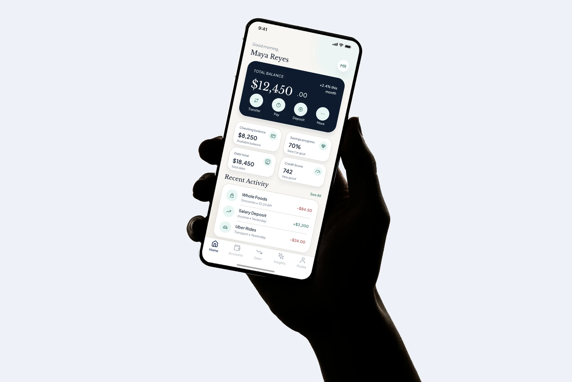
Clarity focuses on checking, savings, debt, and credit so the next step is easier to see.
User Research
I spoke with three people about how they manage payments, savings, and credit. The sample was small, so I used the findings as direction, not validation.
3 interviews · Ages 27–35
Jenna, 35
“I know I should save and pay down debt, but I never know what to do first.”
PRIORITY
Ryan, 27
“I need to know what payment actually helps, not just see another balance.”
PAYMENT GUIDANCE
Heidi, 29
“If I have to update everything by hand, I’ll stop using it after a week.”
SETUP EFFORT
What changed
Three patterns shaped the first prototype.
Priority
Show the next useful action first.
Guidance
Turn balances into clearer payment decisions.
Effort
Keep setup and maintenance light.
Market Scan
I reviewed three finance apps to see what worked, what felt heavy, and where Clarity could stay focused.
Mint (legacy)
USEFUL
Detailed history
WATCH
Too much to manage
Rocket Money
USEFUL
Bill control
WATCH
Narrow focus
NerdWallet
USEFUL
Helpful guidance
WATCH
Content-heavy
What I kept
The audit helped me keep the first prototype focused.
Focus
Daily status, payoff planning, and credit.
Clarity
Simple hierarchy and plain labels.
Scope
Advanced planning saved for later.
Paper before pixels.
I sketched the core flow first, then checked the structure in simple wireframes.
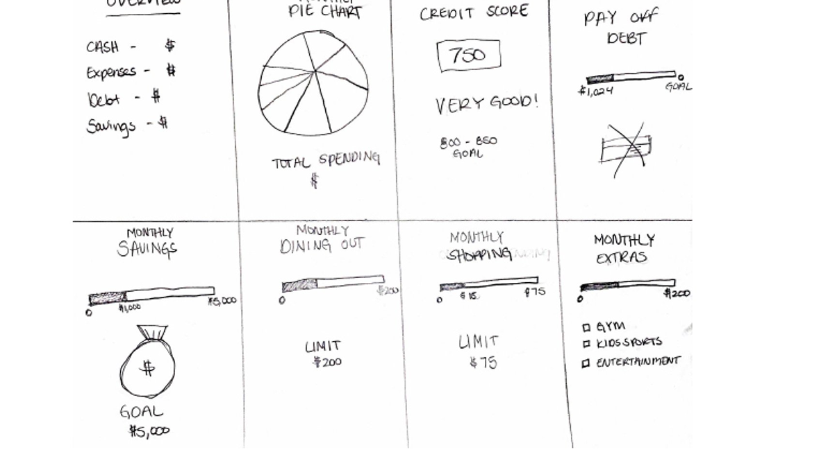
Early sketches explored hierarchy, progress, and the three core tasks.
Core Flows
Each flow answered one question and led to one clear next step.
CHECK BALANCE
Balance
QUESTION
Where do I stand?
SCREEN
Checking
RESULT
Daily overview
REVIEW CREDIT
Credit
QUESTION
What can I improve?
SCREEN
Credit Score
RESULT
Clear next steps
PLAN PAYOFF
Payoff
QUESTION
What should I pay?
SCREEN
Debt
RESULT
Monthly guidance
Design System
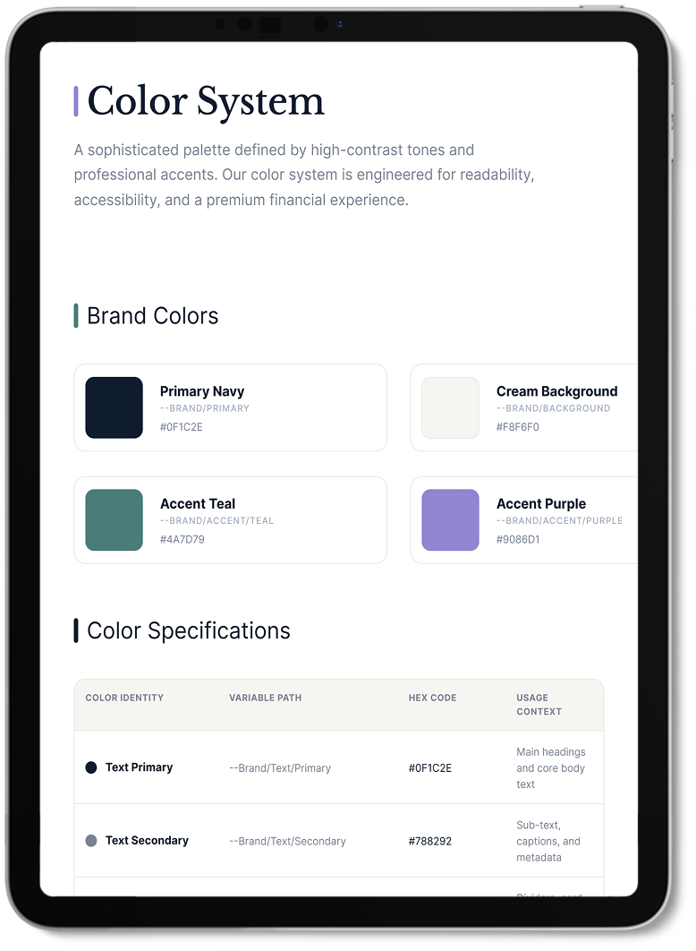
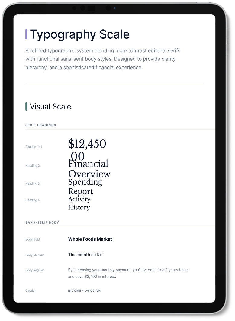
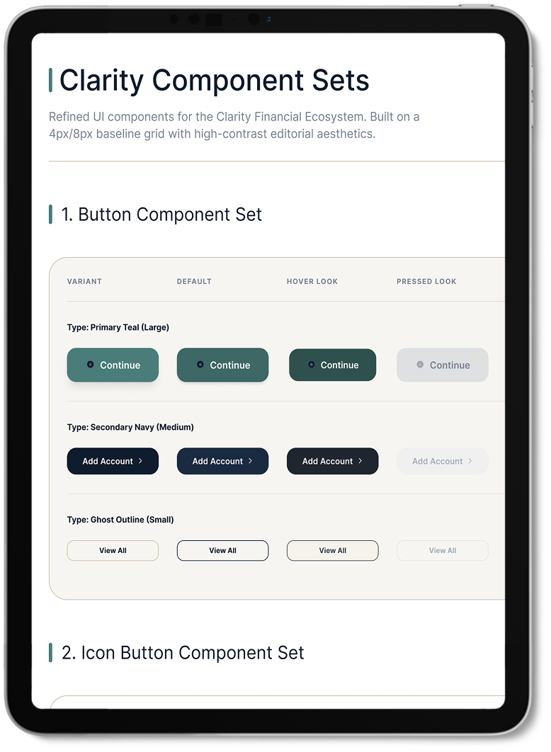
A calm, consistent system built for quick scanning.
CLARITY UI KIT
Color, type, and components stayed consistent.
Final Design
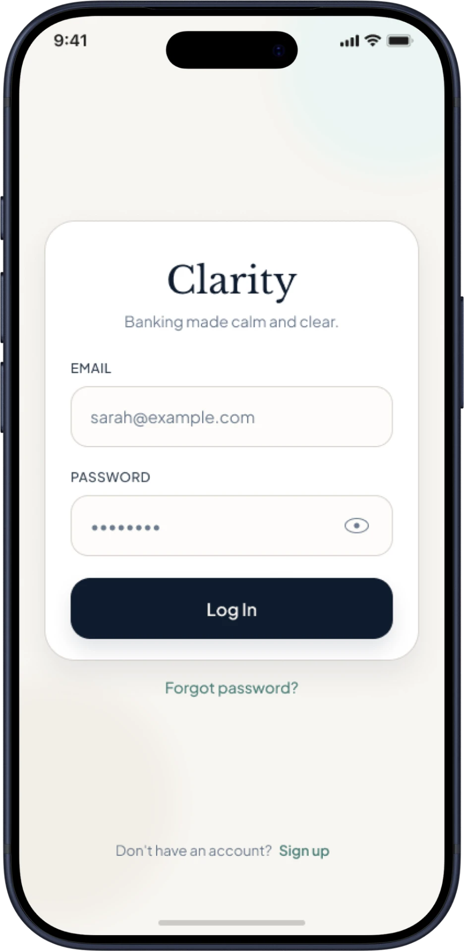
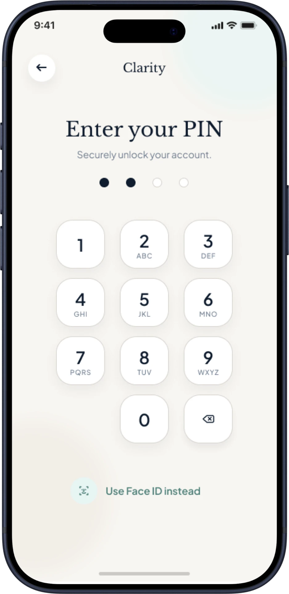
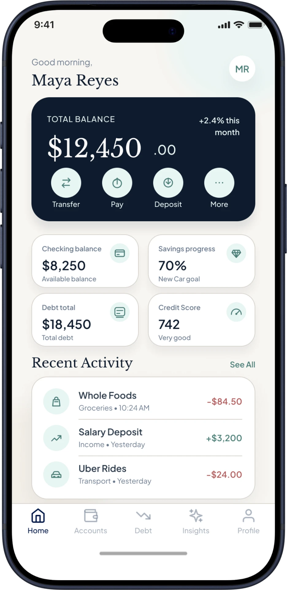
Quick entry, clear balances, and useful guidance.
Access
Login, PIN, and a quick dashboard view.
Login
PIN Entry
Homepage
Overview
Balances, activity, and core actions in one place.
Daily Banking
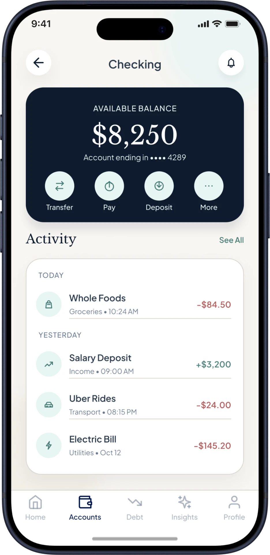
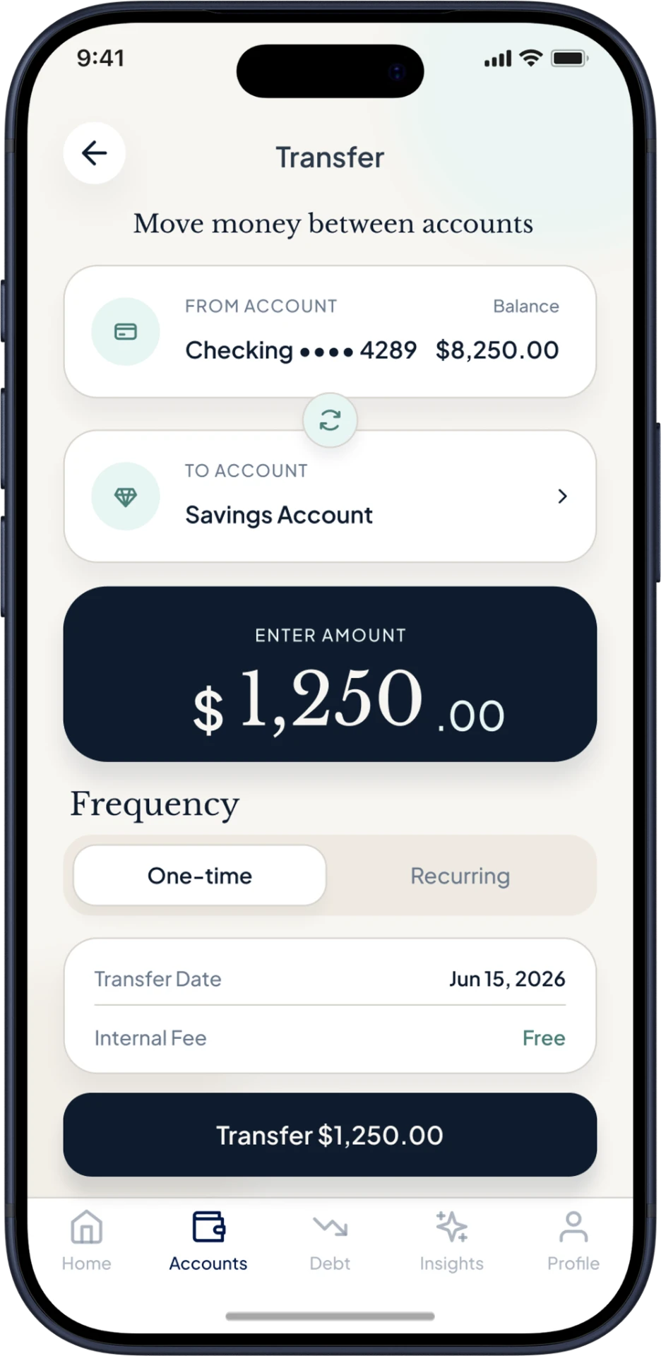
Checking, transfers, and navigation.
Checking
Transfer
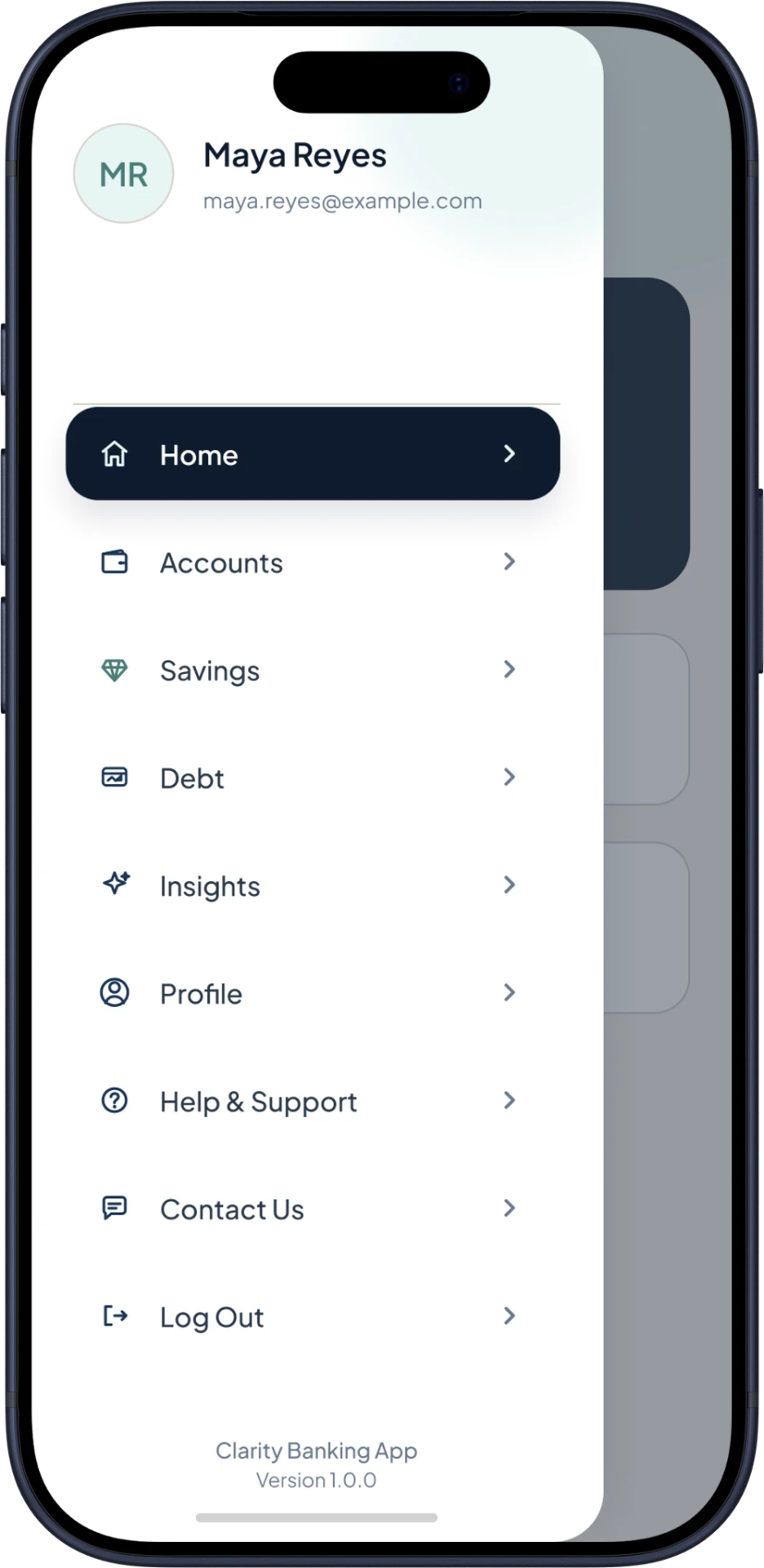
Nav Drawer
Financial Progress
Savings, payment guidance, and credit.
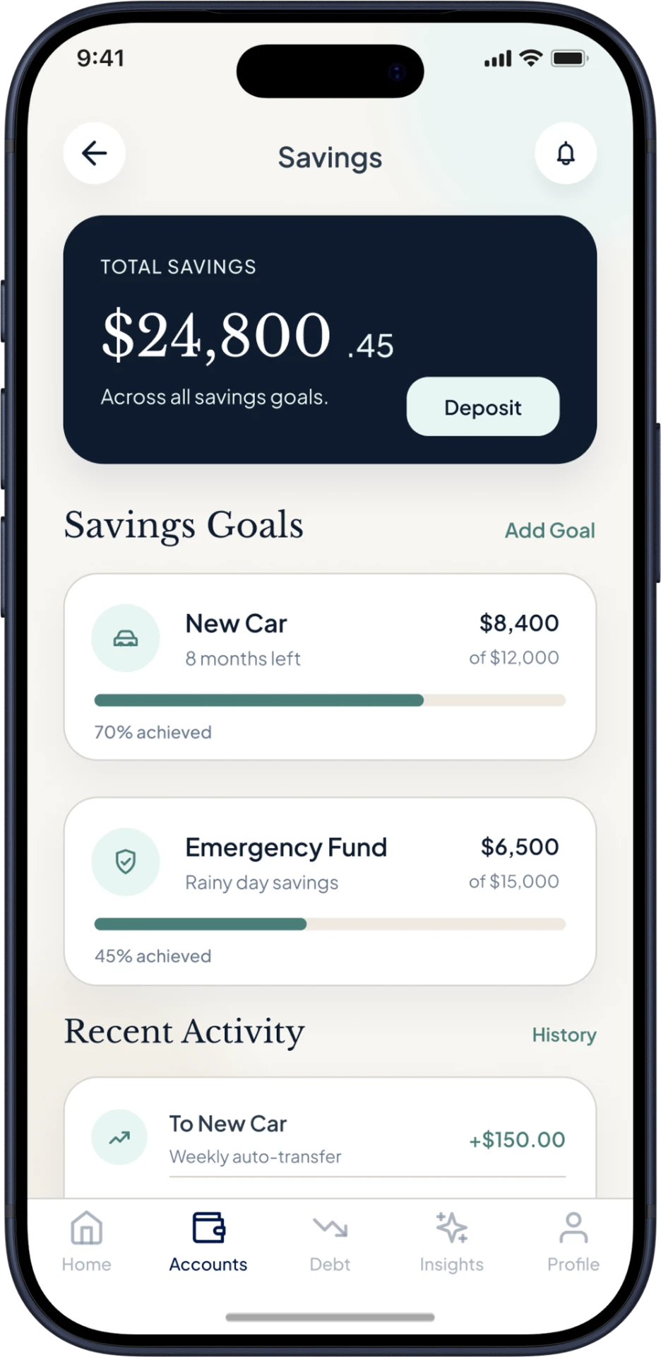
Savings
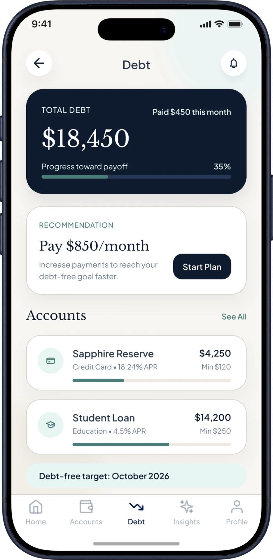
Debt
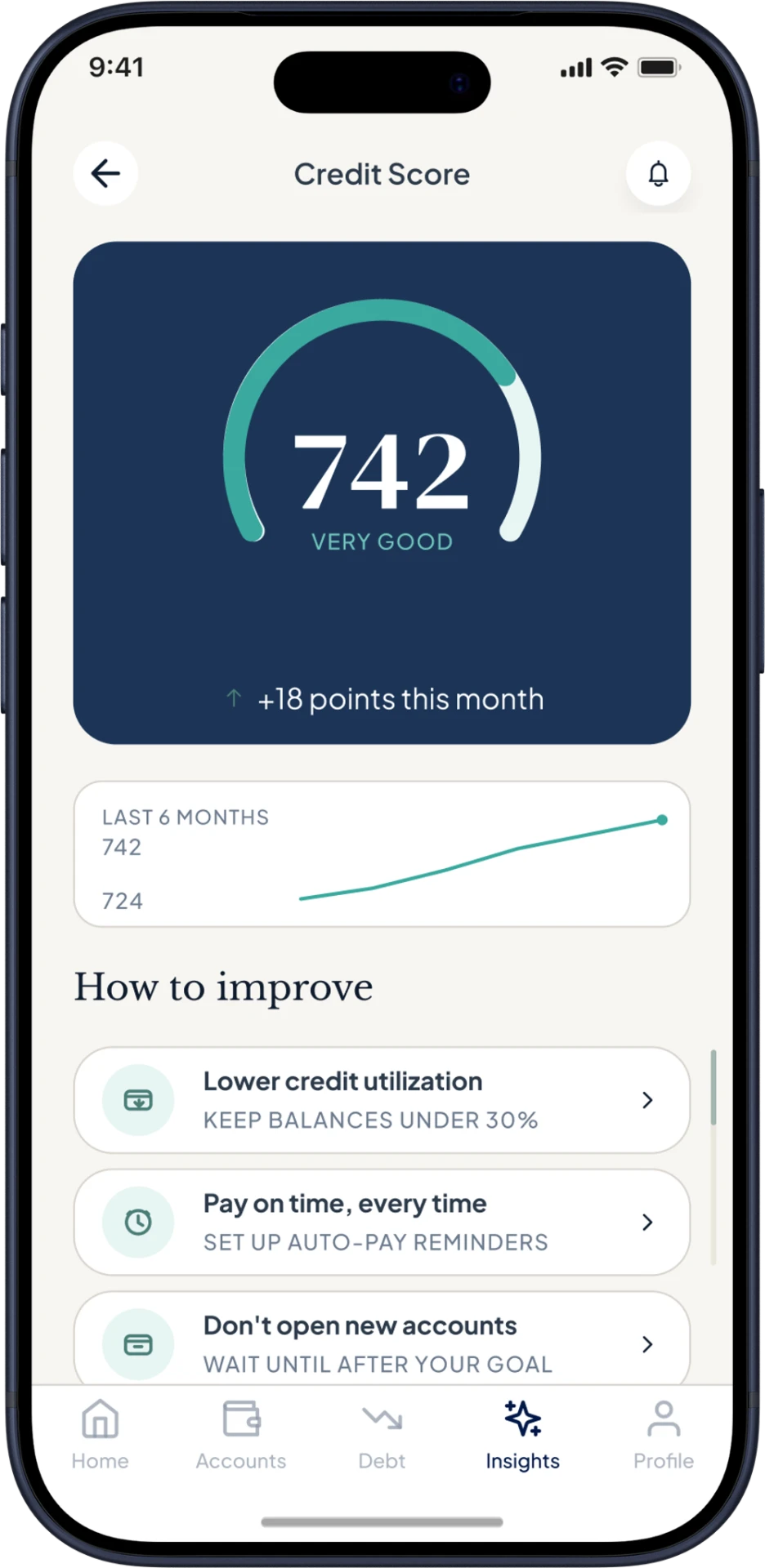
Credit Score
Test & Refine
Four people tested the early flow. Their feedback led to two revisions.
4
PARTICIPANTS
2
REVISIONS
One clear question per screen worked best.
That shift improved the debt flow and kept the first prototype focused.
Next
A few things still need another pass.
Simplify onboarding
Clarify account setup
Review accessibility
Test the full flow
TAKEAWAY
Clearer choices mattered more than more features.
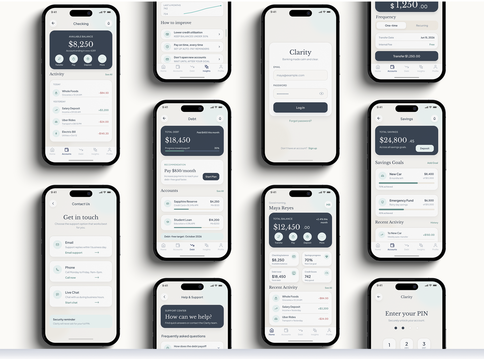
A focused banking concept for everyday financial choices.
A UX concept project, not a live product, and not affiliated with any financial institution.
More Projects
View All
editorial. digital. refined.
Strong structure, intuitive flow, and an editorial eye across UX/UI, web, and visual design.
Charlotte, NC · Remote / hybrid-friendly
© 2026 Amy Design Studio