Hidden items
Key theme
Items get forgotten once they leave the front of the closet.
VISIBILITY GAPCONCEPT UX/UI CASE STUDY · 2026
A faster way to see, style, and rewear what you own.
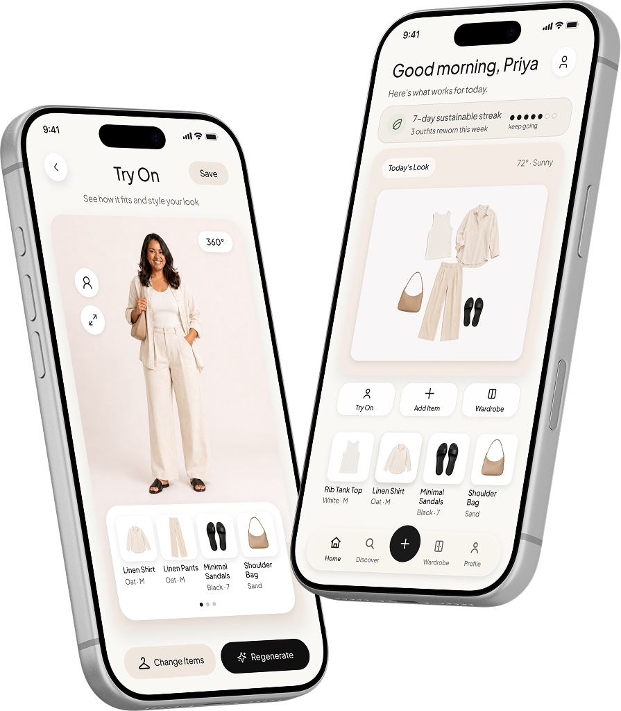
WornWell combines closet import, outfit discovery, and body-inclusive previews to make daily outfit decisions easier.
PROJECT TYPE
Wardrobe app concept
ROLE
UX/UI Designer · Solo
TOOLS
Figma · FigJam
PLATFORM
iOS concept
TIMELINE
Mar–Jun 2026
OVERVIEW
Research, UX/UI, and prototyping for an inclusive iOS concept.
CORE EXPERIENCE
01
Scan
Add items fast
02
Style
Build outfits
03
Try On
See it on you
DESIGN PROMISE
Less searching. More wearing.
People had plenty to wear, but still struggled to see it, style it, or picture the fit.
THE PROBLEM
Clothes disappeared in crowded closets, setup felt tedious, and most styling tools offered little help with fit.
THE SOLUTION
WornWell imports closet photos, organizes detected items, and previews outfits on more representative bodies.
01
Full closets
Users owned enough, but still felt stuck.
02
Low visibility
Items were forgotten once they left view.
03
Poor representation
Fit previews rarely reflected real bodies.
KEY INSIGHT
Research pattern
The issue was visibility and confidence.
That insight shifted WornWell from inventory tracking to faster outfit decisions.
Three interviews surfaced the same barriers: visibility, decision fatigue, and poor representation.
40–50
ITEMS OWNED
60%
OF CLOSET UNWORN
3/3
WANTED BETTER FIT PREVIEWS
Hidden items
Key theme
Items get forgotten once they leave the front of the closet.
VISIBILITY GAPSlow mornings
User pain point
Outfit decisions take too long on busy days.
DECISION FATIGUEPoor fit previews
User pain point
Styling tools rarely show bodies like theirs.
REPRESENTATION GAPRESEARCH SYNTHESIS
The research narrowed the first prototype to three priorities: see the closet, preview the fit, and save the look.
01
INTERVIEW NOTES
Interview notes captured routines, frustrations, and wardrobe habits.
02
AFFINITY MAP
Themes clustered around visibility, time, and representation.
03
KEY THEMES
Three priorities guided the first prototype.
I reviewed Acloset, Whering, and Stylebook to see where closet apps stopped short.
THE OPPORTUNITY GAP
Existing apps catalogued clothing well, but rarely helped users picture the finished outfit on themselves.
KEY TAKEAWAY
The gap was confidence, not cataloguing.
Three questions shaped the comparison.
01
Organization
Competitors handled tagging and sorting well.
02
Missing
Few offered realistic outfit previews.
03
Opportunity
Body-inclusive try-on paired with fast closet import.
01
Acloset
Closet organizer
STRENGTH
Fast tagging
GAP
Flat previews
Strong at cataloguing, limited at showing the finished look.
02
Whering
Sustainable styling
STRENGTH
Rewear focus
GAP
Generic bodies
Encouraged rewearing but did not reflect different body types.
03
Stylebook
Wardrobe planner
STRENGTH
Deep tracking
GAP
Manual setup
Powerful for planners, heavy for first-time setup.
THE OPENING
WornWell could own the moment between owning clothes and wearing them well.

Priya
47 · Corporate lawyer
Plus-size · Busy and polished
PERSONA
She owns enough. She needs faster decisions.
IN HER WORDS
I want to stop shopping and style what I already own.
GOALS
FRUSTRATIONS
I sketched the import, discovery, and try-on flows before refining the interface.
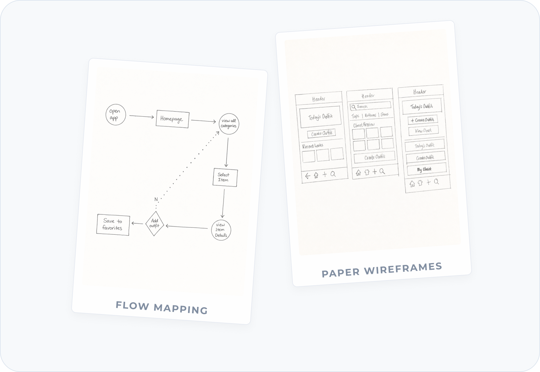
Early sketches explored feature priority and screen hierarchy.
Wireframes reduced each screen to one clear task.
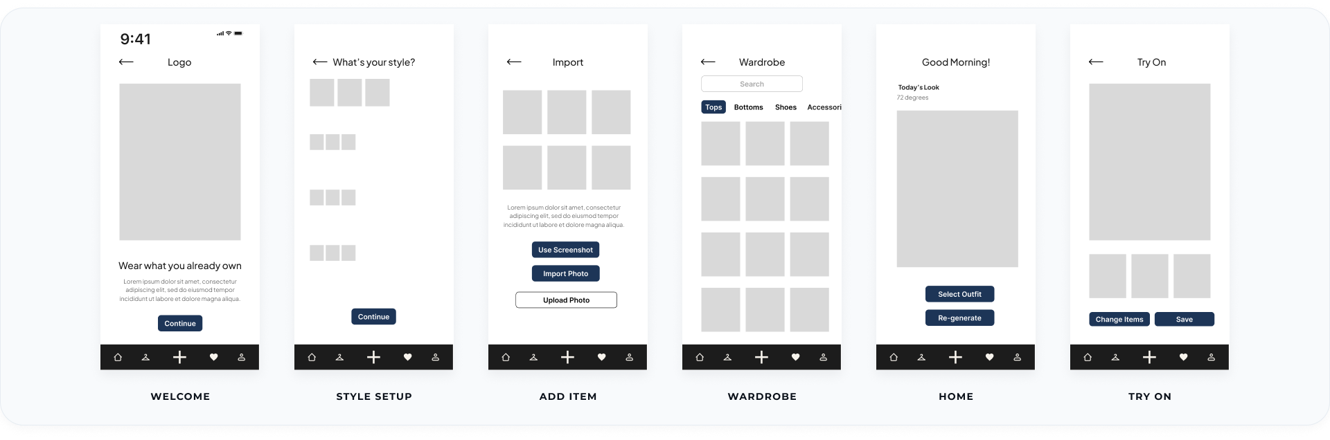
Lo-fi wireframes mapped onboarding, item import, wardrobe organization, and try-on.
MID-FI FOCUS
The mid-fi pass focused on wardrobe visibility, daily outfit selection, and virtual try-on.
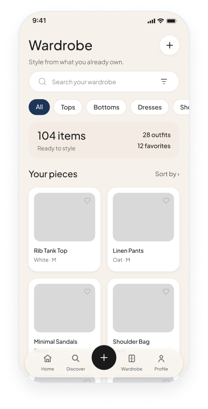
WARDROBE
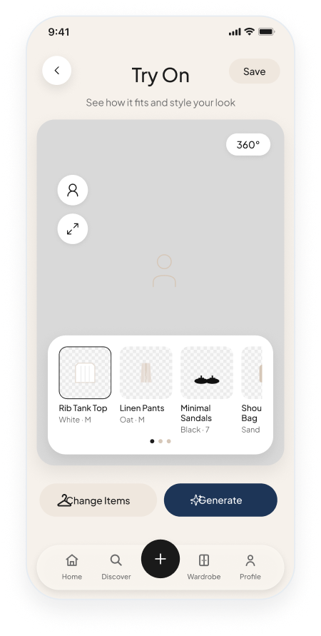
TRY ON
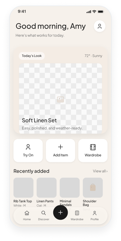
HOME
Each flow answered one question and led to one clear next step.
FLOW STRATEGY
Need. Screen. Outcome.
Every screen needed one clear job.
Need
User goal
Screen
Screen used
Outcome
Next step
01
USER TASK
Import closet
CORE
NEED
Capture closet
SCREEN
Smart Import
OUTCOME
Closet in app
02
USER TASK
Build an outfit
PREVIEW
NEED
See it on me
SCREEN
Try On
OUTCOME
Confident pick
03
USER TASK
Save the look
ACTION
NEED
Rewear outfits
SCREEN
Saved Looks
OUTCOME
Look saved
WHY THIS MATTERED
Every screen had a task, a user need, and a clear reason to exist.
A focused system made the interface easier to scan and maintain.
01
Color
Cream, taupe, sage, and coral create calm contrast.
02
Components
Buttons, cards, navigation, and controls share one system.
03
Patterns
Repeated layouts make closets and outfits easier to scan.
A restrained palette keeps hierarchy clear.
TEXT PRIMARY
#111111
CREAM BACKGROUND
#F7F3EC
SAGE SOFT
#C8D3C1
TAUPE DEEP ACCENT
#B8957F
ERROR SOFT CORAL
#C78375
CORE EXPERIENCE
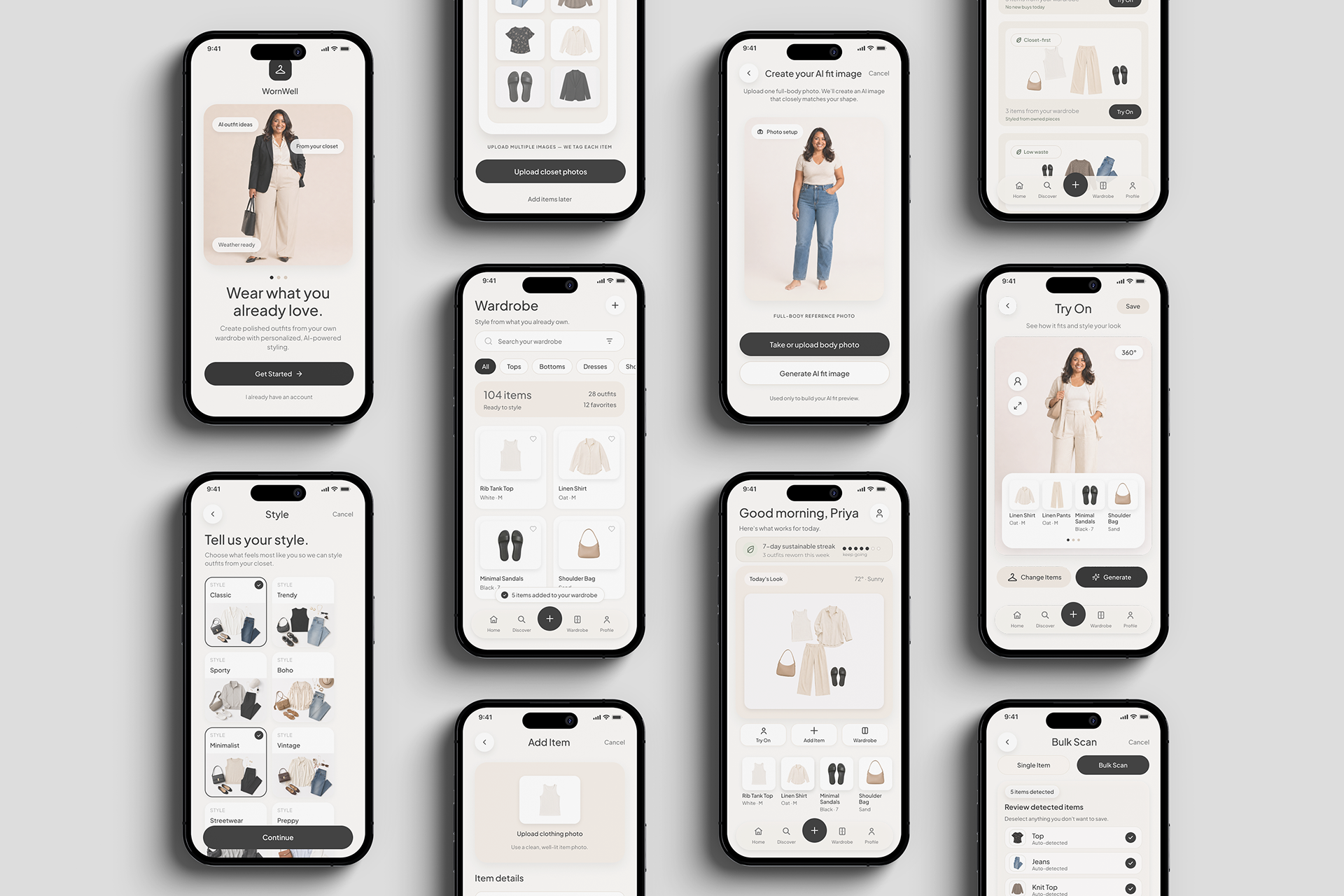
Three connected screens show how WornWell turns uploaded clothing into outfit ideas and a realistic try-on preview.
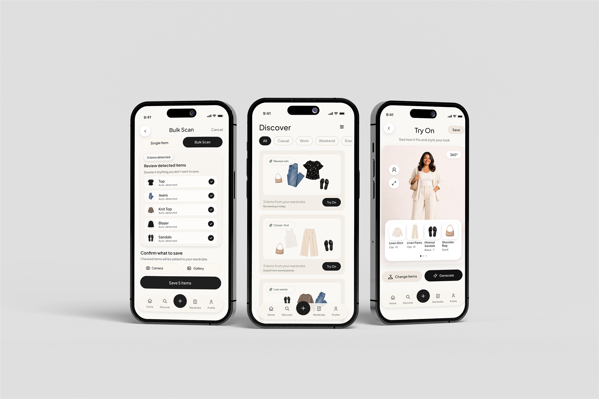
Bulk scan, closet-first discovery, and AI try-on create one connected styling flow.
Thirteen final screens follow the journey from onboarding to daily styling, discovery, and profile management.
First-time setup introduces WornWell, captures personal style, and begins closet building.
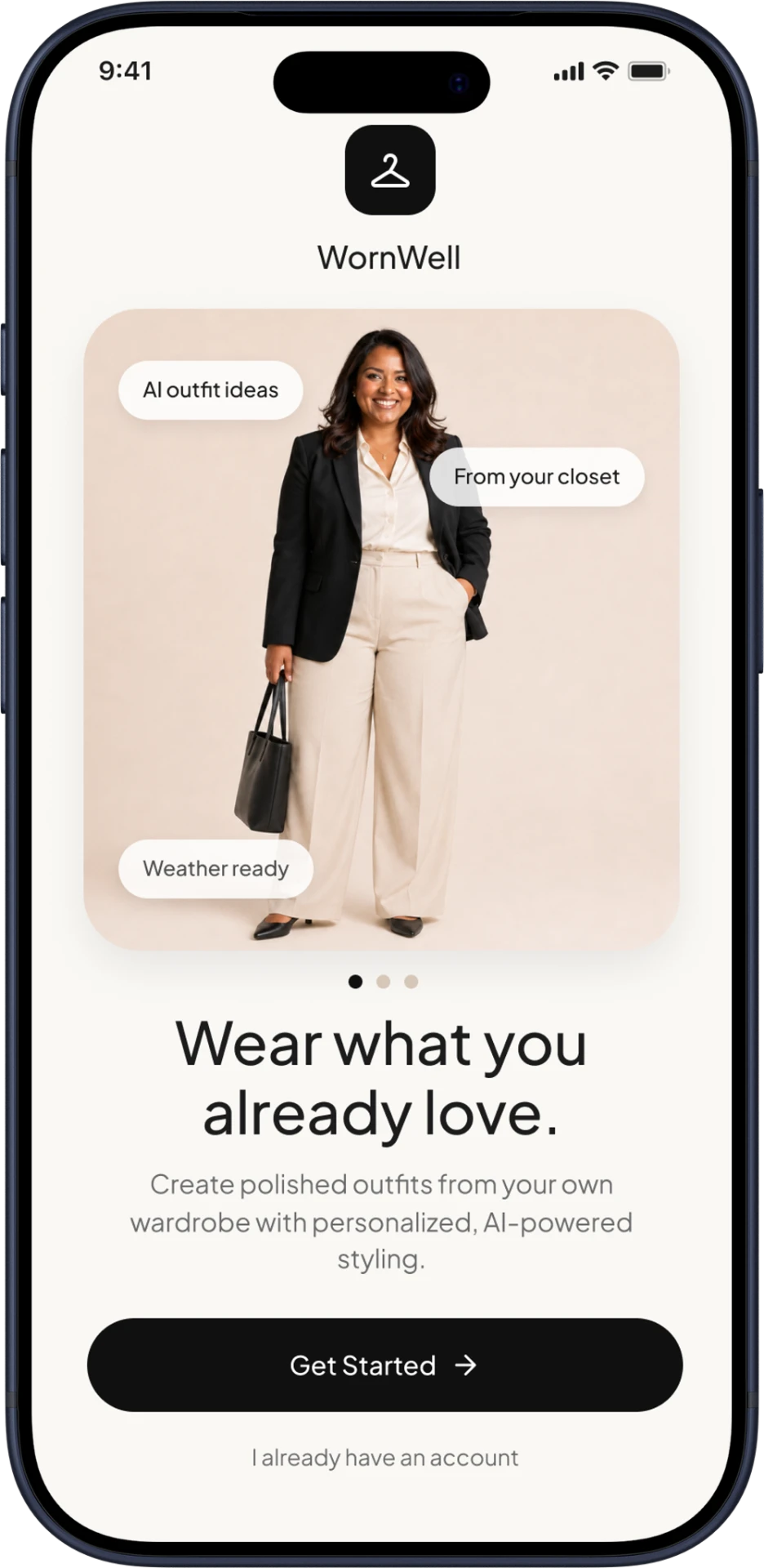
WELCOME / FIRST-TIME ENTRY
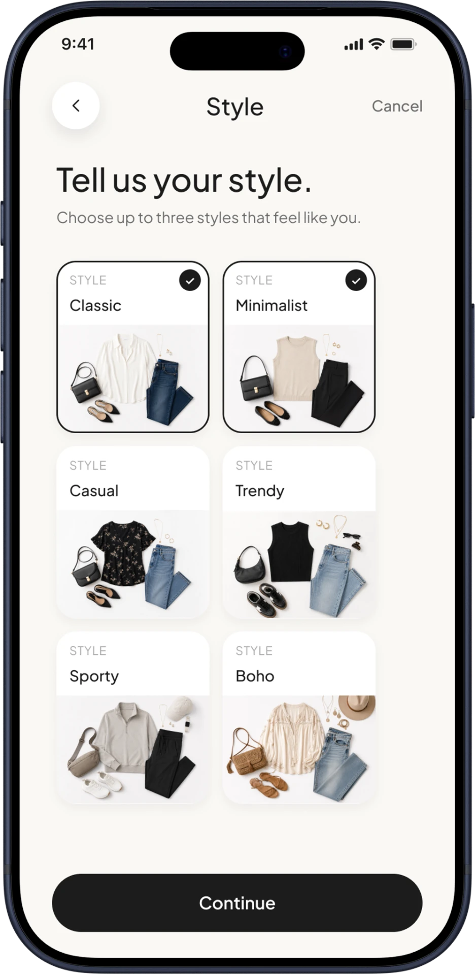
STYLE PREFERENCES
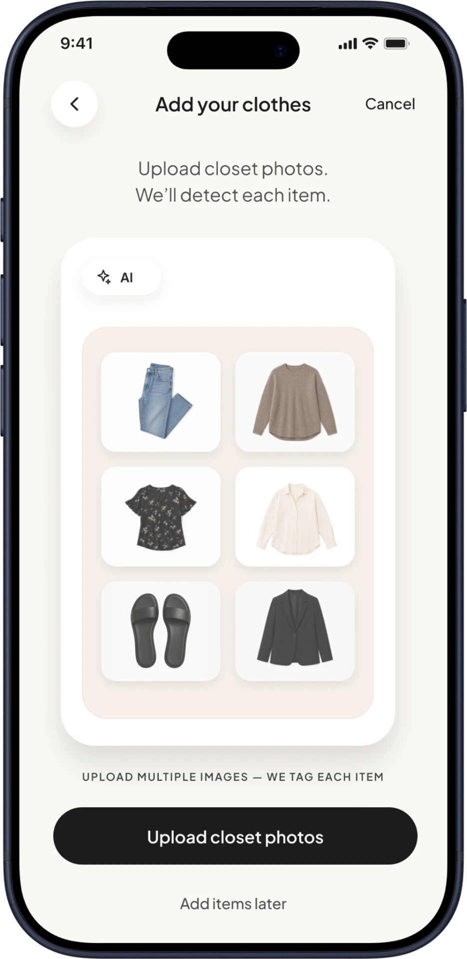
ADD YOUR CLOTHES
Users can bulk scan or add one item, then review AI-generated details before saving.
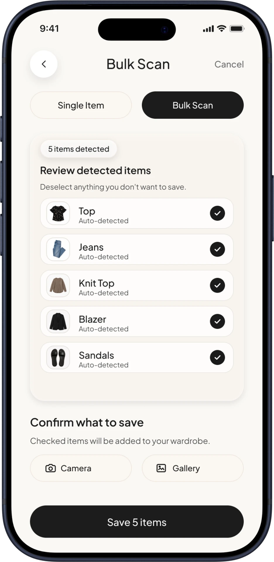
BULK UPLOAD / AI SCAN
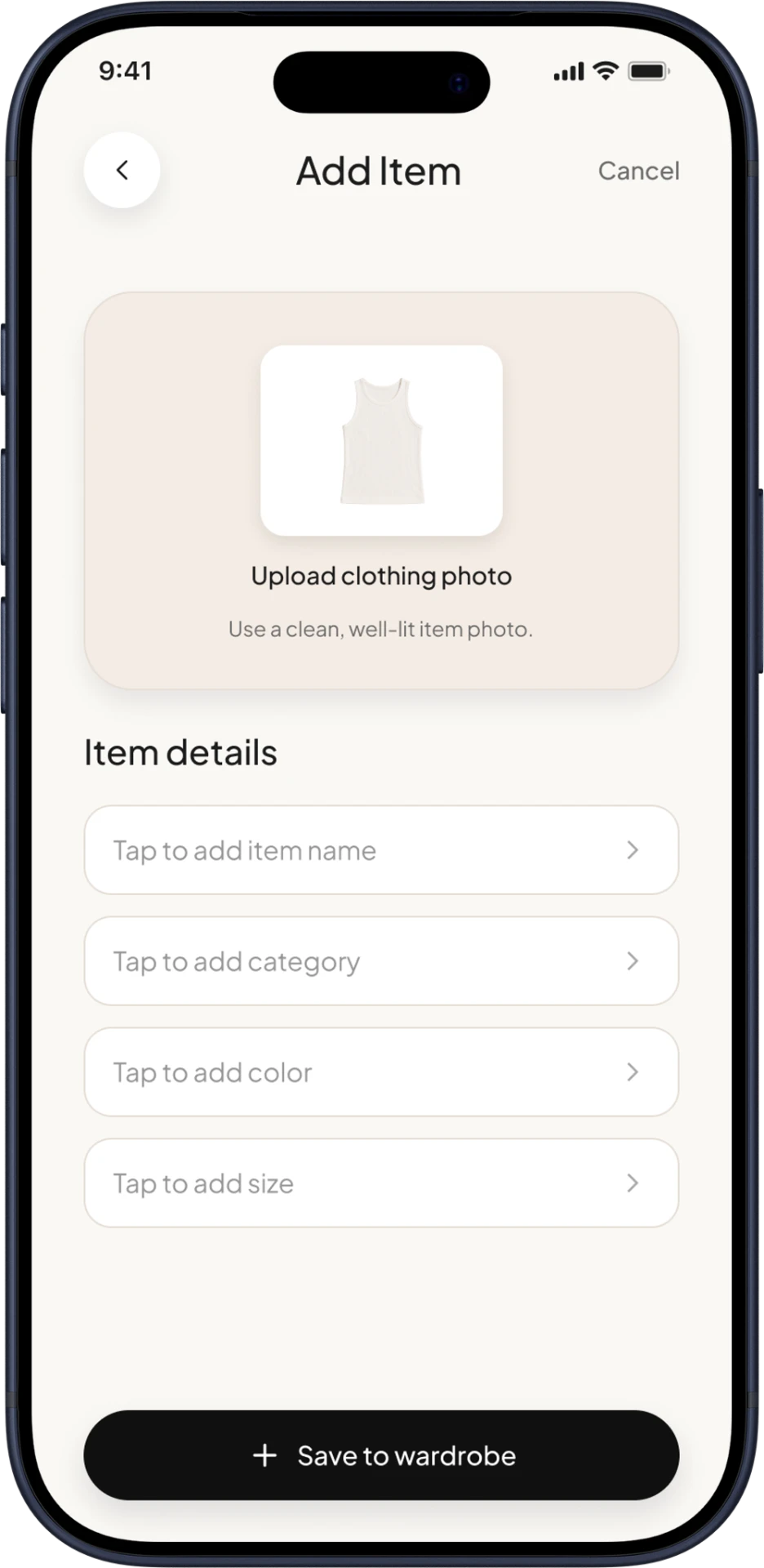
MANUAL ADD ITEM
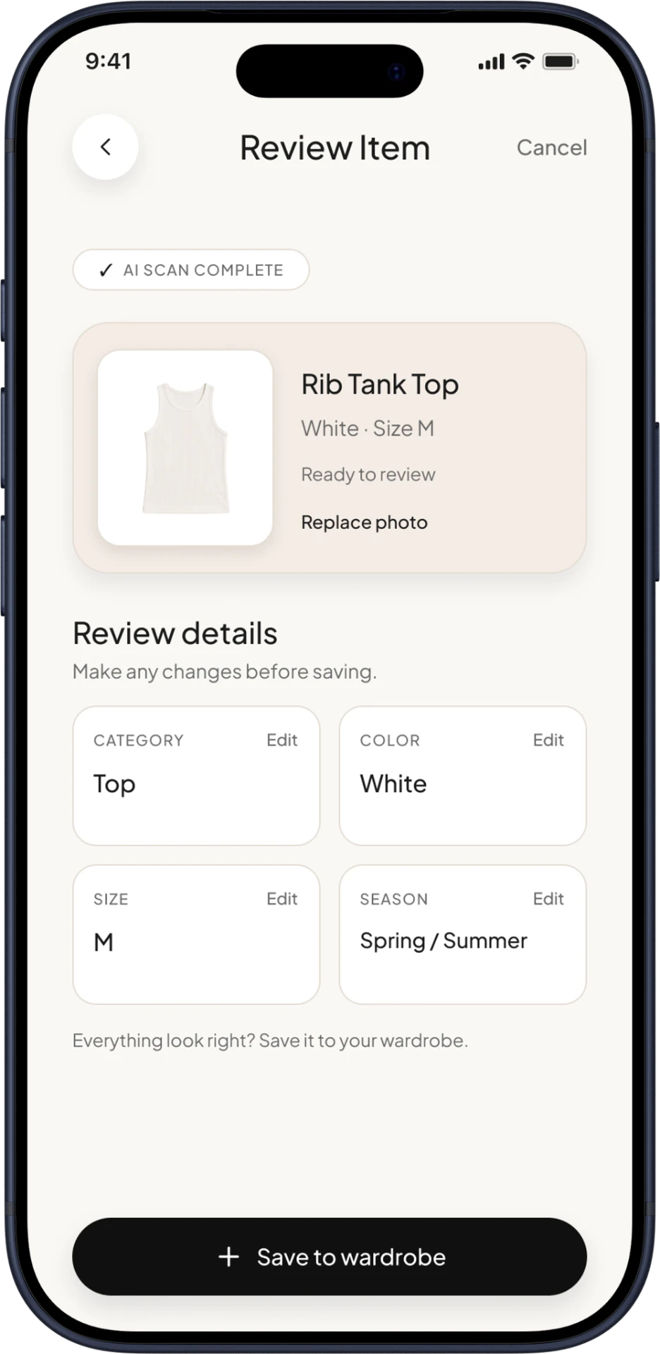
POST-SCAN REVIEW
Core screens support browsing pieces, viewing details, and returning to the daily dashboard.
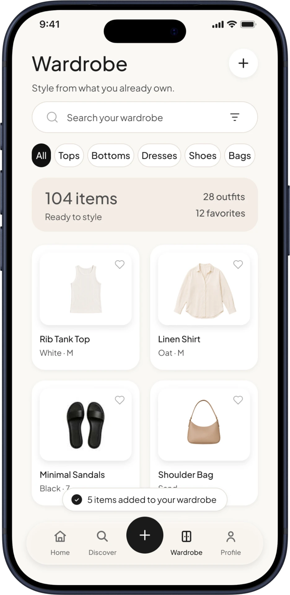
WARDROBE
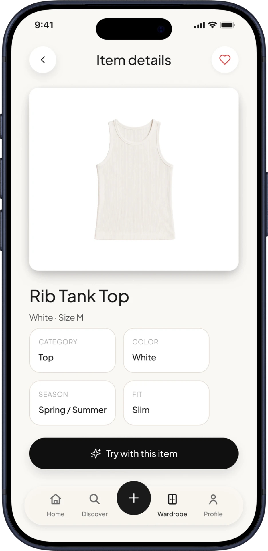
ITEM DETAIL / FAVORITE
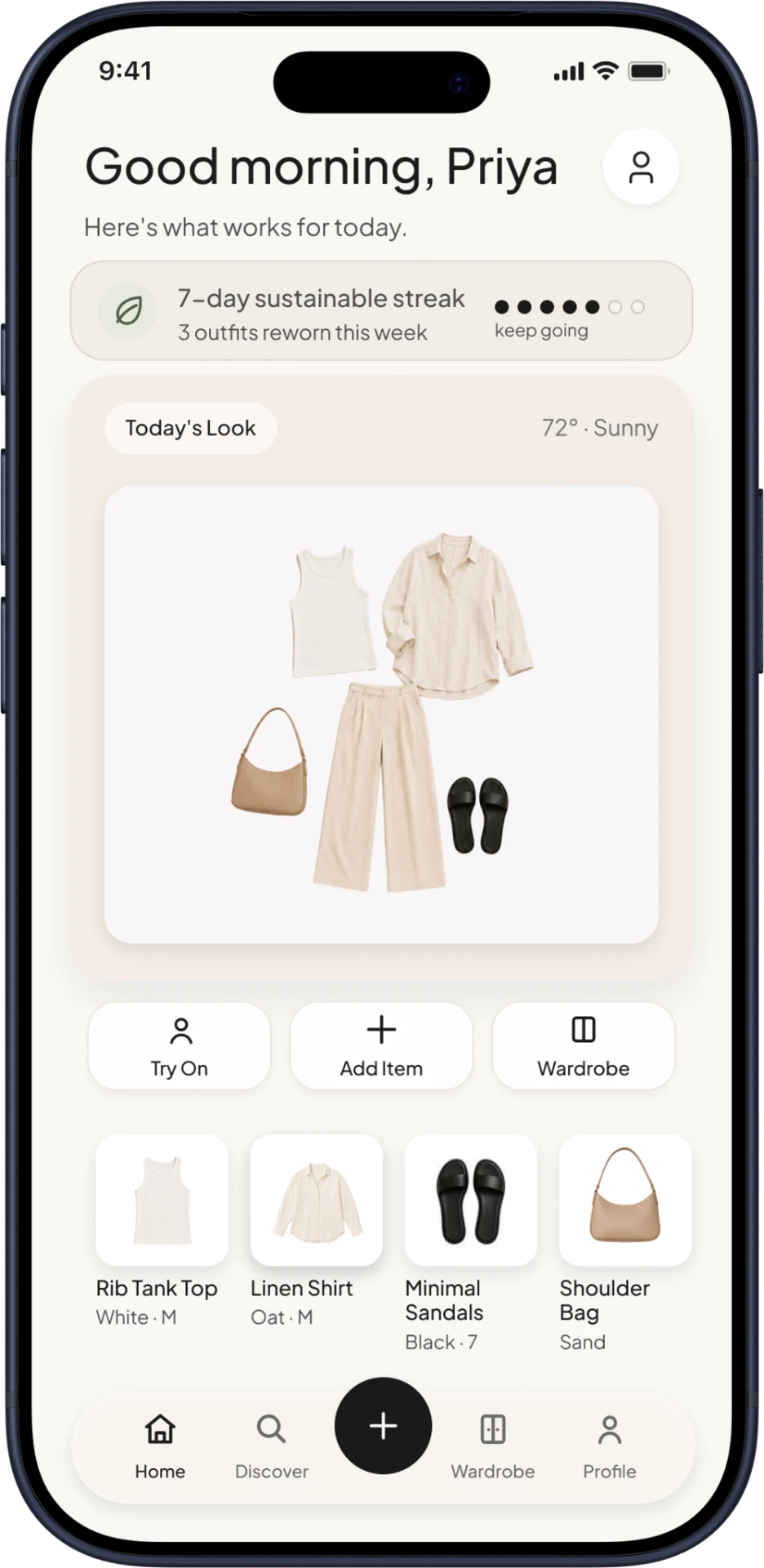
HOME / DAILY DASHBOARD
Users create an AI fit image and preview complete outfits from their own closet.
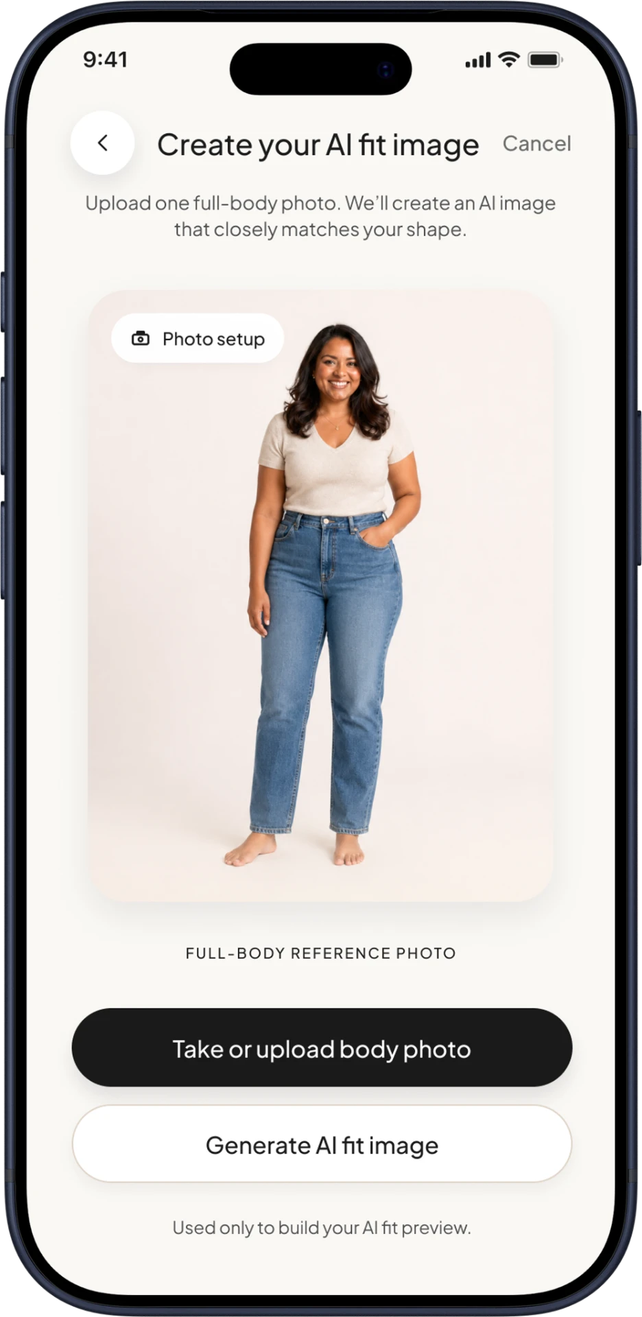
AVATAR FIT SETUP
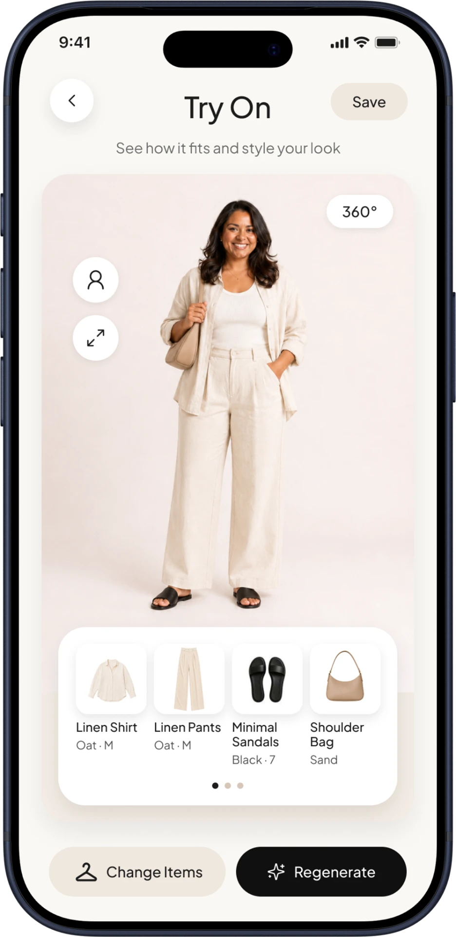
VIRTUAL TRY-ON
Discovery suggests new combinations. Profile stores preferences, favorites, and saved looks.
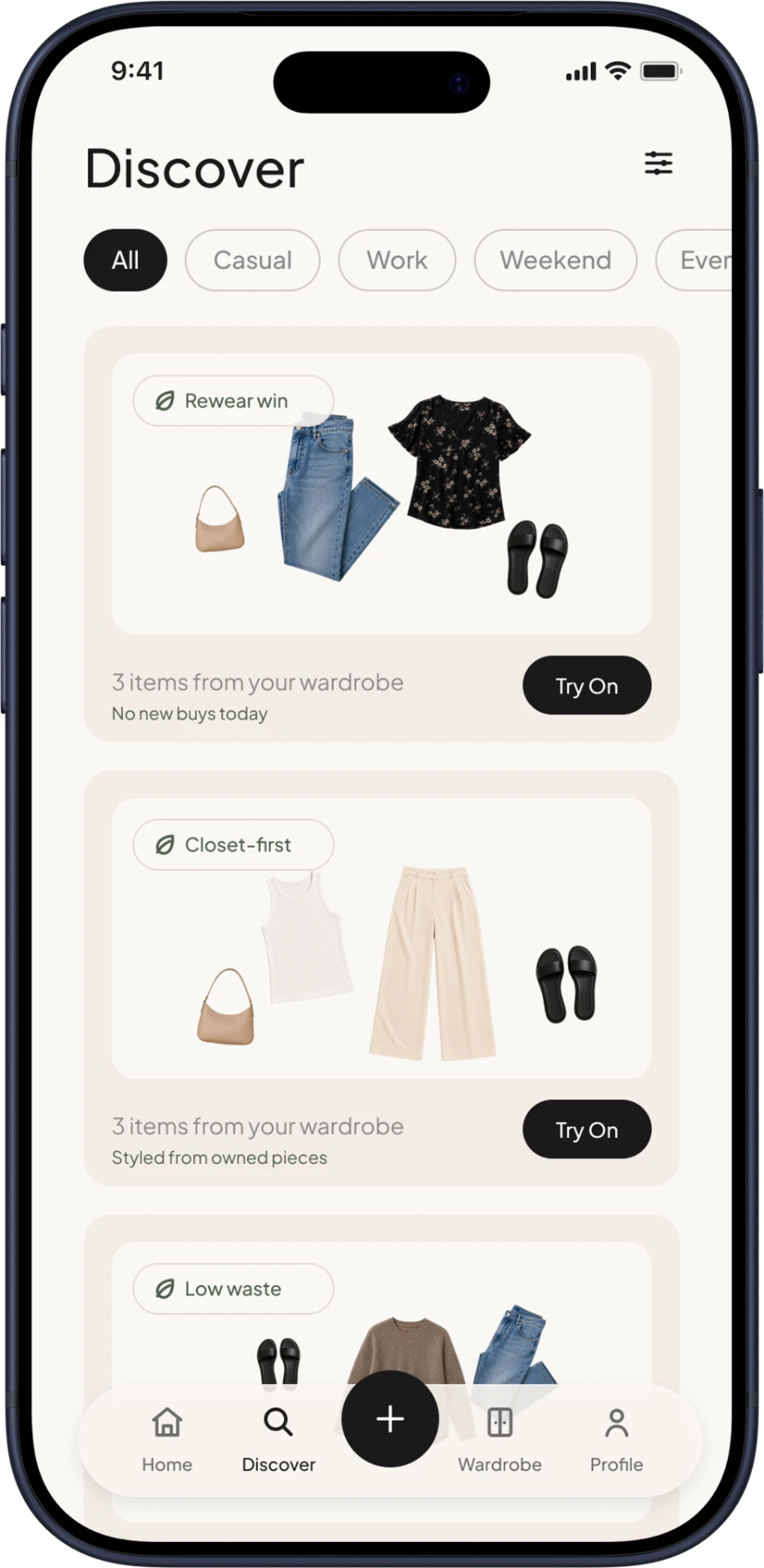
DISCOVER
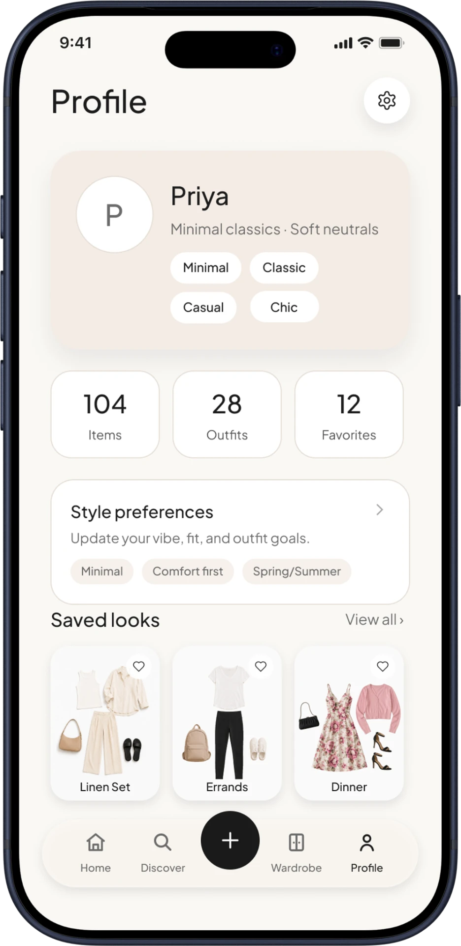
PROFILE / SAVED LOOKS
Across two rounds with five participants each, clearer labels and a stronger upload CTA resolved the main navigation issues.
WHY IT MATTERED
The strongest screens turned uncertainty into a clear next step.
Broader participants, deeper comfort and mobility filters, and AI suggestions shaped by real feedback.
Refine the foundation before adding complexity.
Screen reader testing · More body options · Voice navigation · Weather + occasion context
Validate the full flow, then expand recommendations.
KEY TAKEAWAY
Fewer, clearer features built more confidence.
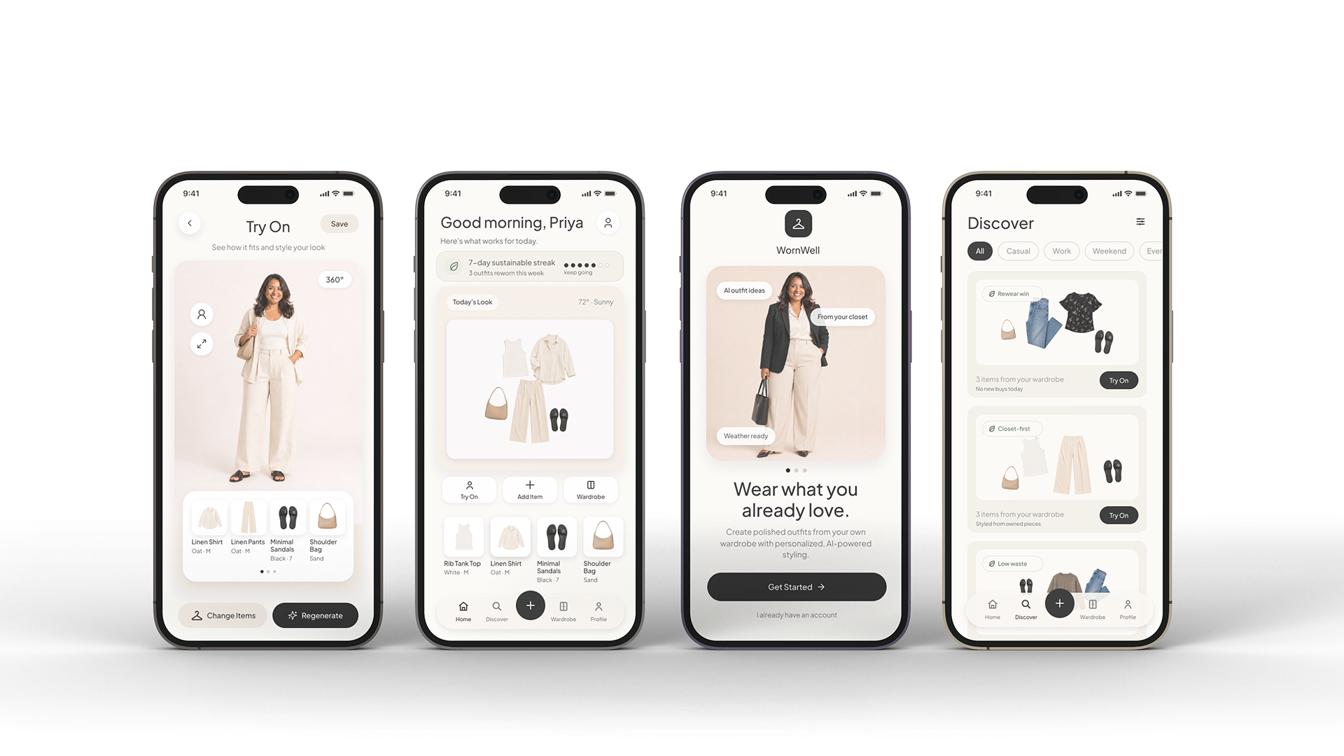
WornWell was designed to help users feel confident getting dressed through visible closets, realistic previews, and sustainable rewearing.
A UX concept project, not a live product, and not affiliated with any fashion retailer.
editorial. digital. refined.
Strong structure, intuitive flow, and an editorial eye across UX/UI, web, and visual design.
Charlotte, NC · Remote / hybrid-friendly
© 2026 Amy Design Studio