LIVE CLIENT WEBSITE CASE STUDY · 2026
Nooma
Whole-body wellness, reintroduced with clarity and calm.
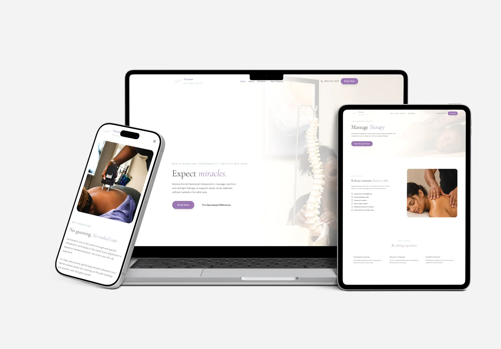
I redesigned and built Nooma Wellness as the practice expanded beyond chiropractic. I clarified the services, softened the visual tone, and made care easier to explore and book.
VIEW LIVE WEBSITEPROJECT TYPE
Wellness website redesign
ROLE
UX/UI + Visual Designer · Solo
SCOPE
Strategy · UX · copy · build
STATUS
Live client website · 2026
TOOLS
Figma · Base44
The Challenge
Problem
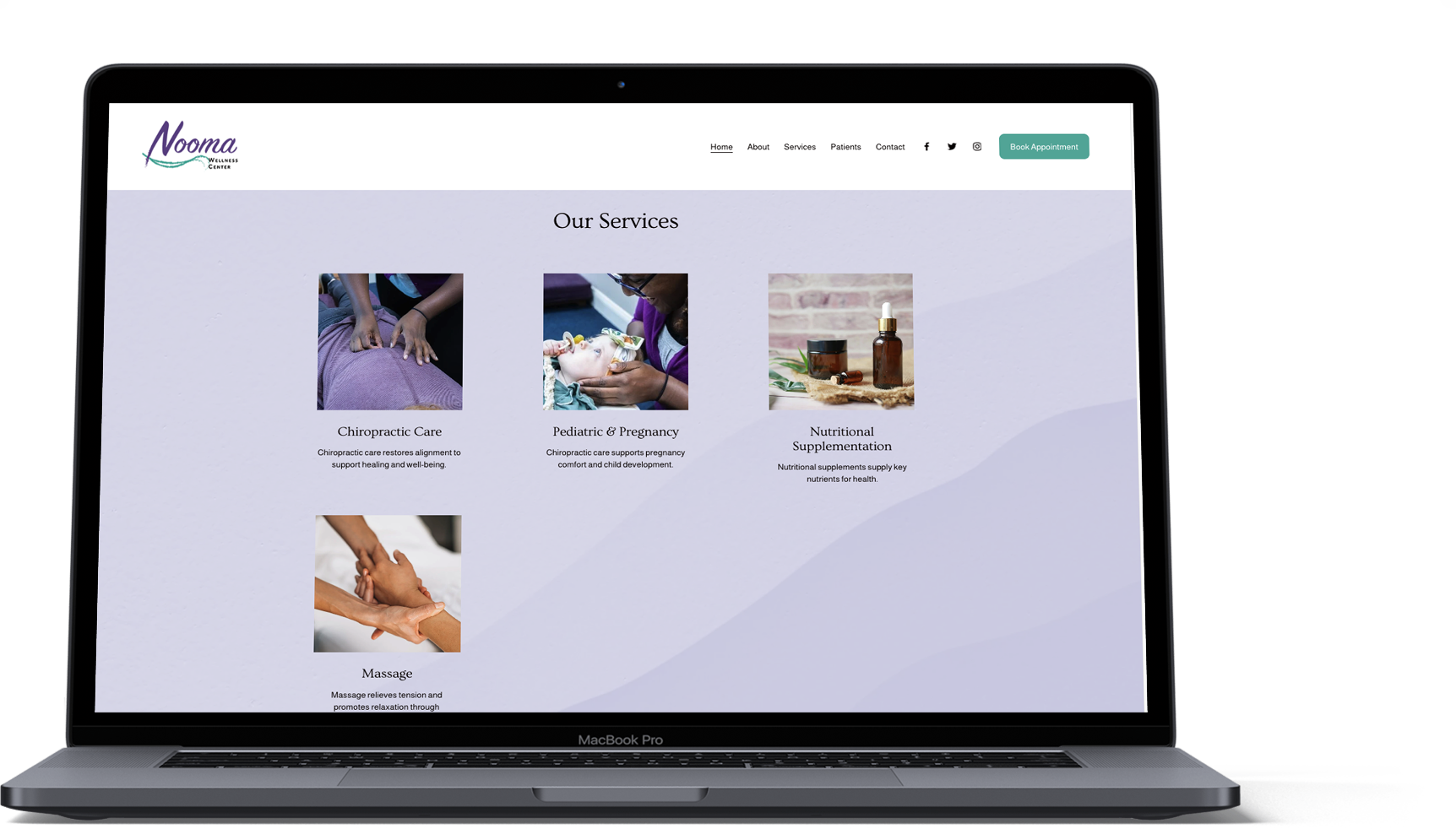
The website still told a chiropractic-first story, even as Nooma had grown into a broader wellness practice.
THE BUSINESS EVOLVED. THE WEBSITE DIDN’T.
Solution
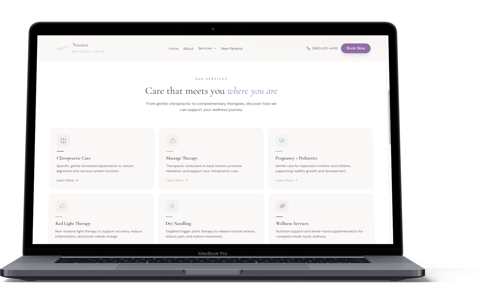
I rebuilt the experience around whole-body care, grouped five services into clear paths, and made booking easier on every screen.
Before & After
BEFORE
Chiropractic-first
AFTER
Wellness-centered
Clearer Paths
I reorganized five services into four focused paths so patients could understand Nooma faster.
THE UX MOVE
One practice. Four clear paths.
A simpler structure made the full wellness offer easier to scan, explain, and grow.
BEFORE
Scattered services
Each offering read like a separate addition instead of one connected care model.
- 01 Gonstead Chiropractic
- 02 Massage Therapy
- 03 Nutrition Support
- 04 Red Light Therapy
- 05 Dry Needling
MORE SERVICES. NO CLEAR SYSTEM.
AFTER
One connected system
I grouped the full offer into four paths with a consistent structure and clearer language.
Chiropractic
Family + precision care
Massage
Recovery + relief
Nutrition
Whole-body support
Therapies
Red light + dry needling
CONTENT ARCHITECTURE · SERVICE DISCOVERY
The structure became easier to understand before any patient reached a service page.
Calm by Design
Nooma’s purple and teal were softened into a calmer digital system.
DESIGN INTENT
Warm, modern, and easy to navigate. The system balances clinical credibility with a softer wellness feel.
COLOR PALETTE
#F5F0FA
Soft Lavender
#DCEFEB
Mist Teal
#7A6FA8
Muted Purple
#2F6F73
Deep Teal
#FFFFFF
White
TYPOGRAPHY
Aa
Cormorant Garamond
Display + headings
Aa
DM Sans
Body, labels, UI
UI STYLING NOTES
Rounded cards, airy spacing
Consistent thin-line icons
Close-cropped wellness imagery
Built to Adapt
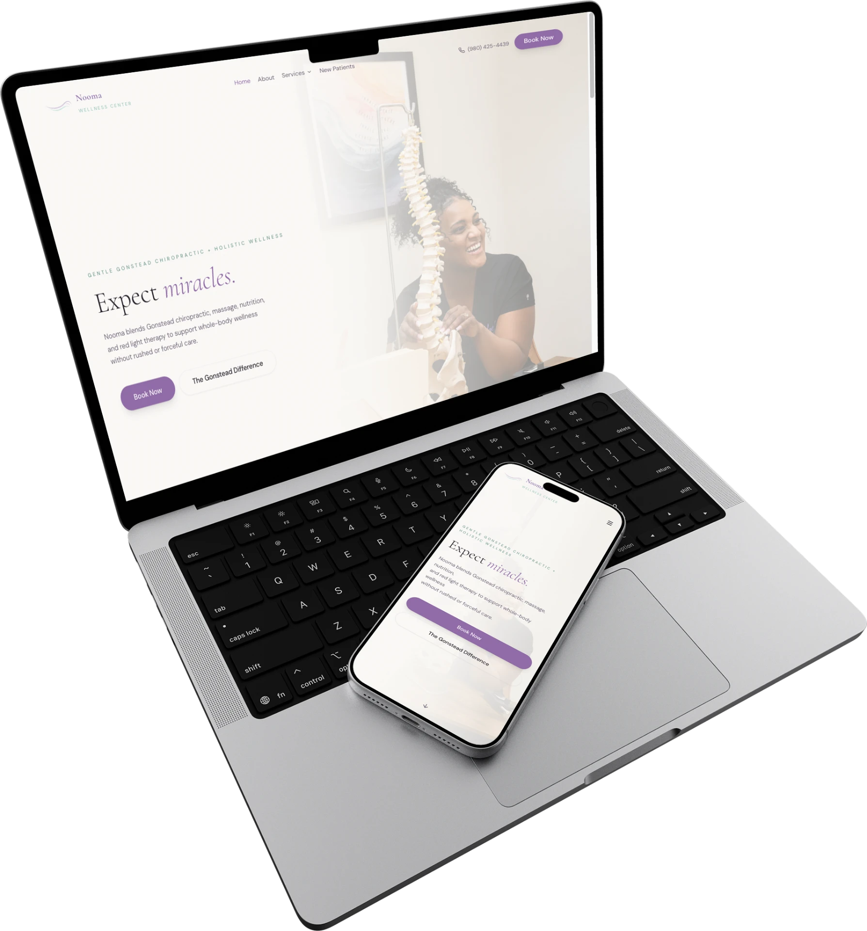
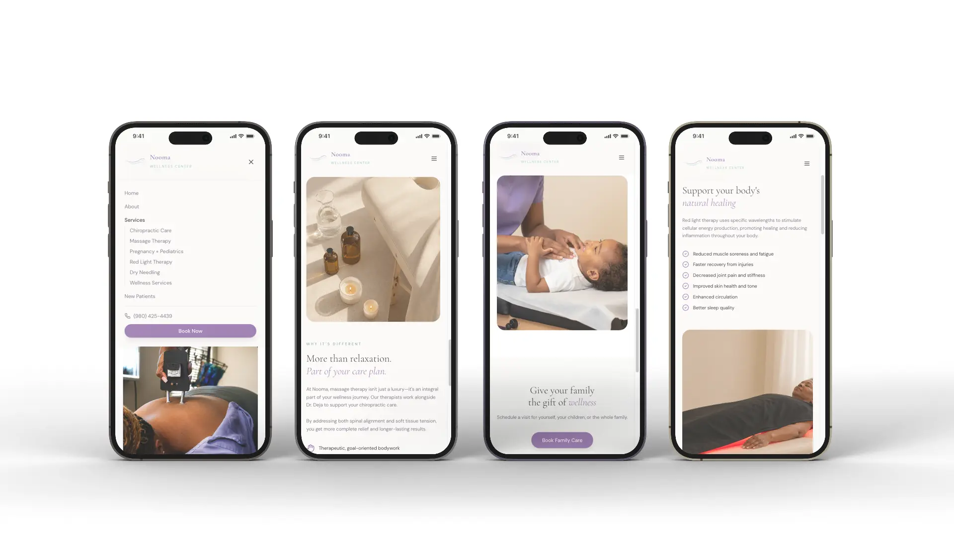
Desktop gives the story. Mobile keeps care easy to explore.
Key Screens
01
Homepage
PURPOSE
Positions Nooma as a whole-body wellness center, not only chiropractic.
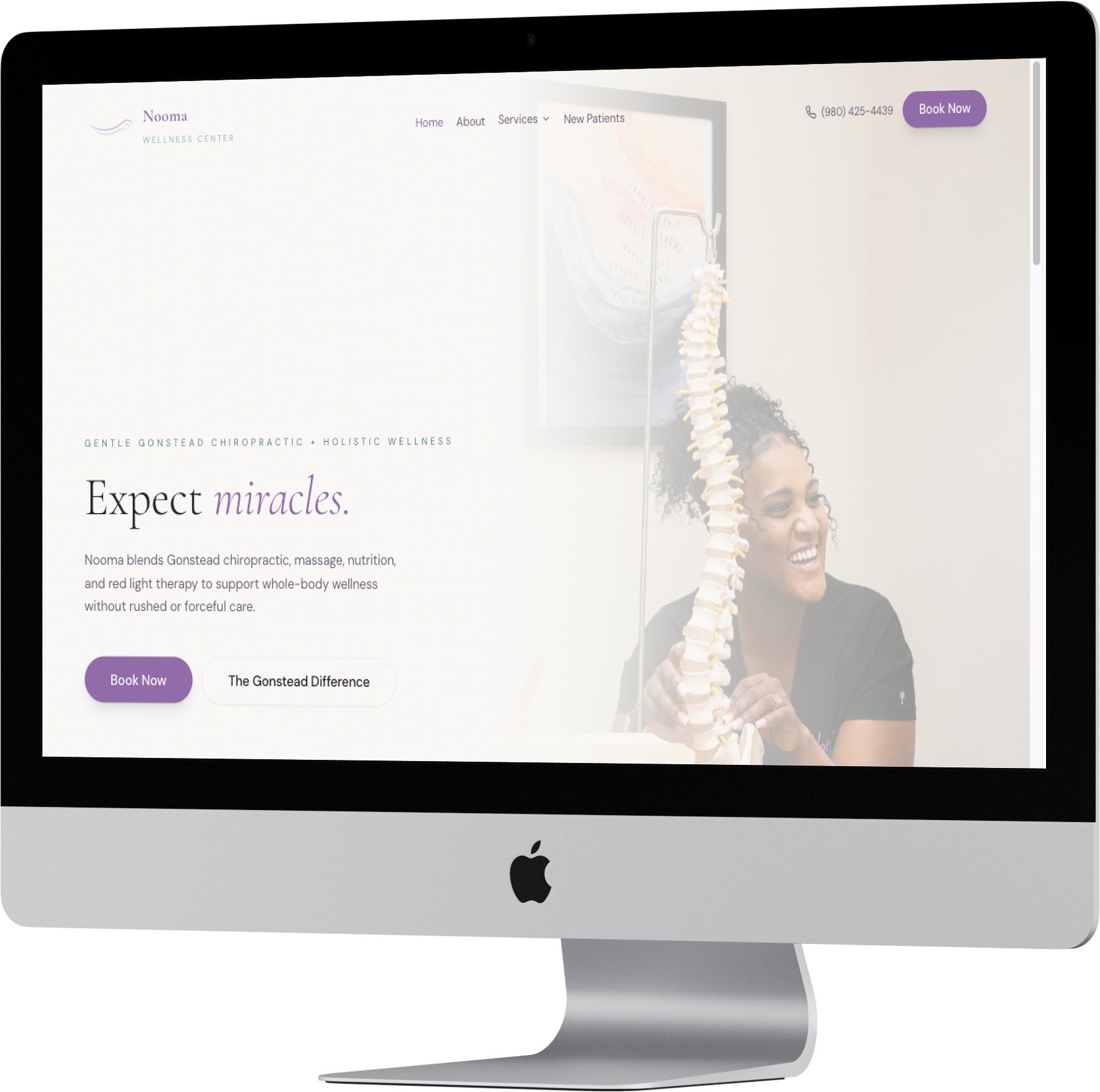
HOMEPAGE HERO · DESKTOP
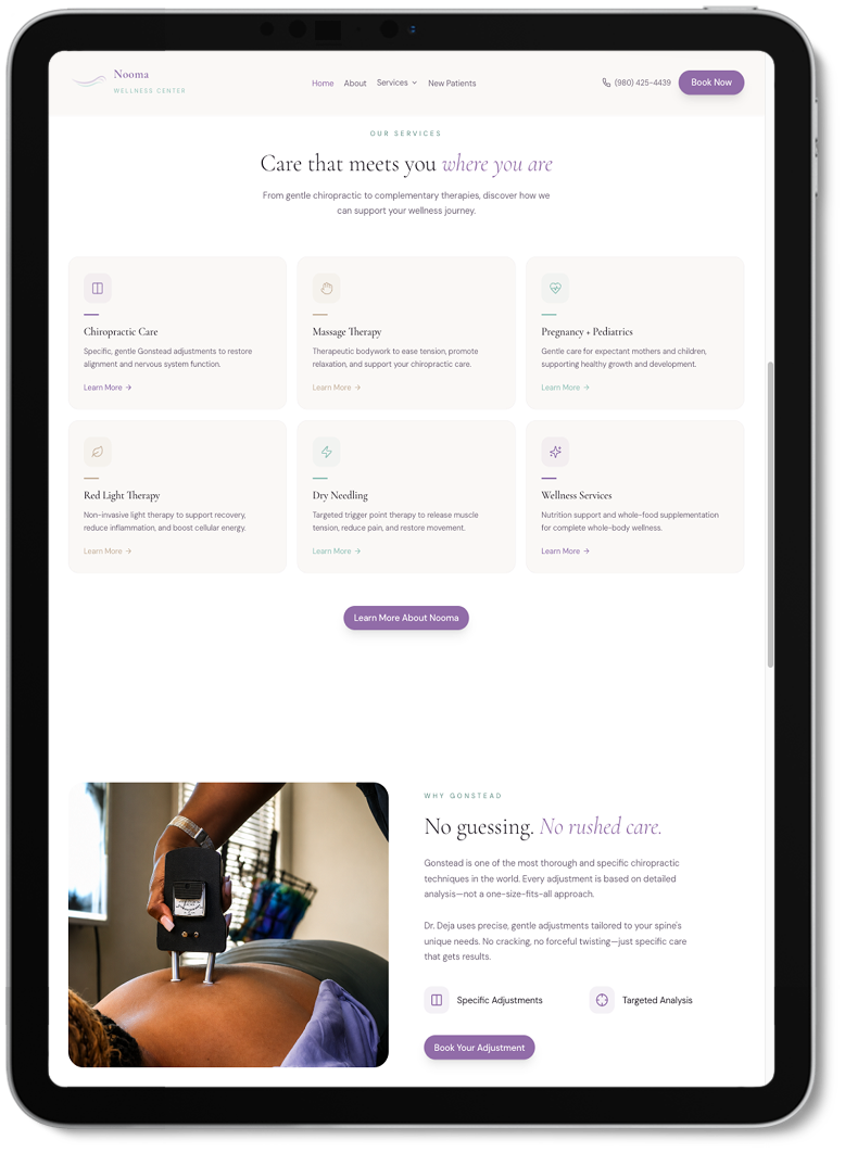
SERVICES OVERVIEW · IPAD
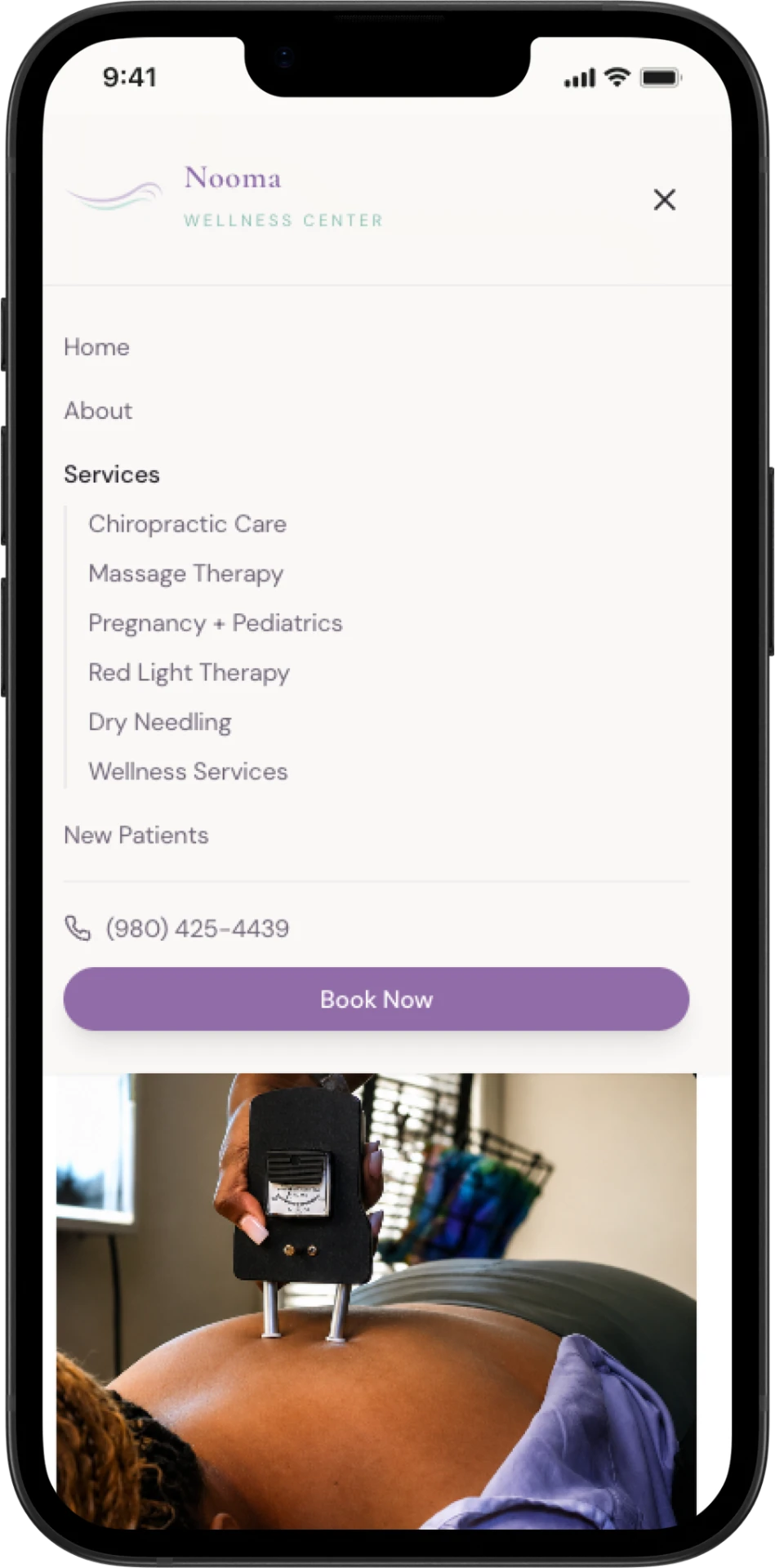
SERVICES MENU · MOBILE
02
Services overview
PURPOSE
Helps patients compare care options quickly.
03
Responsive services page
PURPOSE
Keeps the full service menu clear and easy to scan on larger screens.
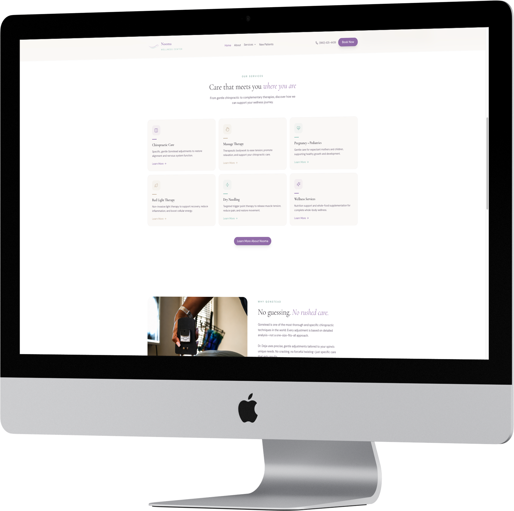
SERVICES MENU · DESKTOP
04
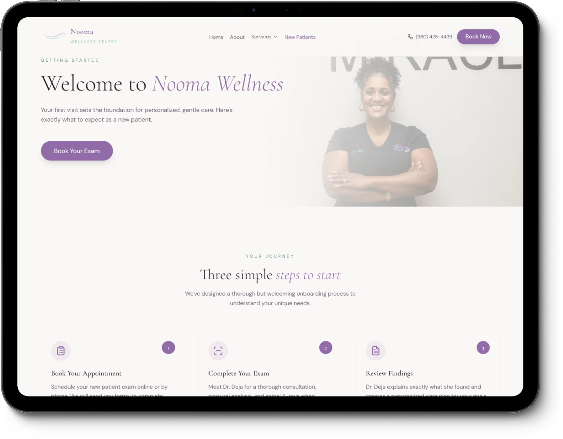
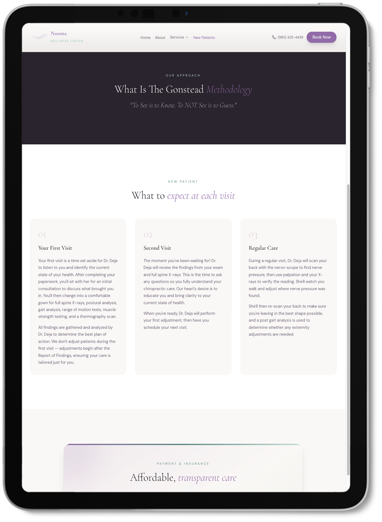
New patient journey
PURPOSE
Keeps the next step close without feeling pushy.
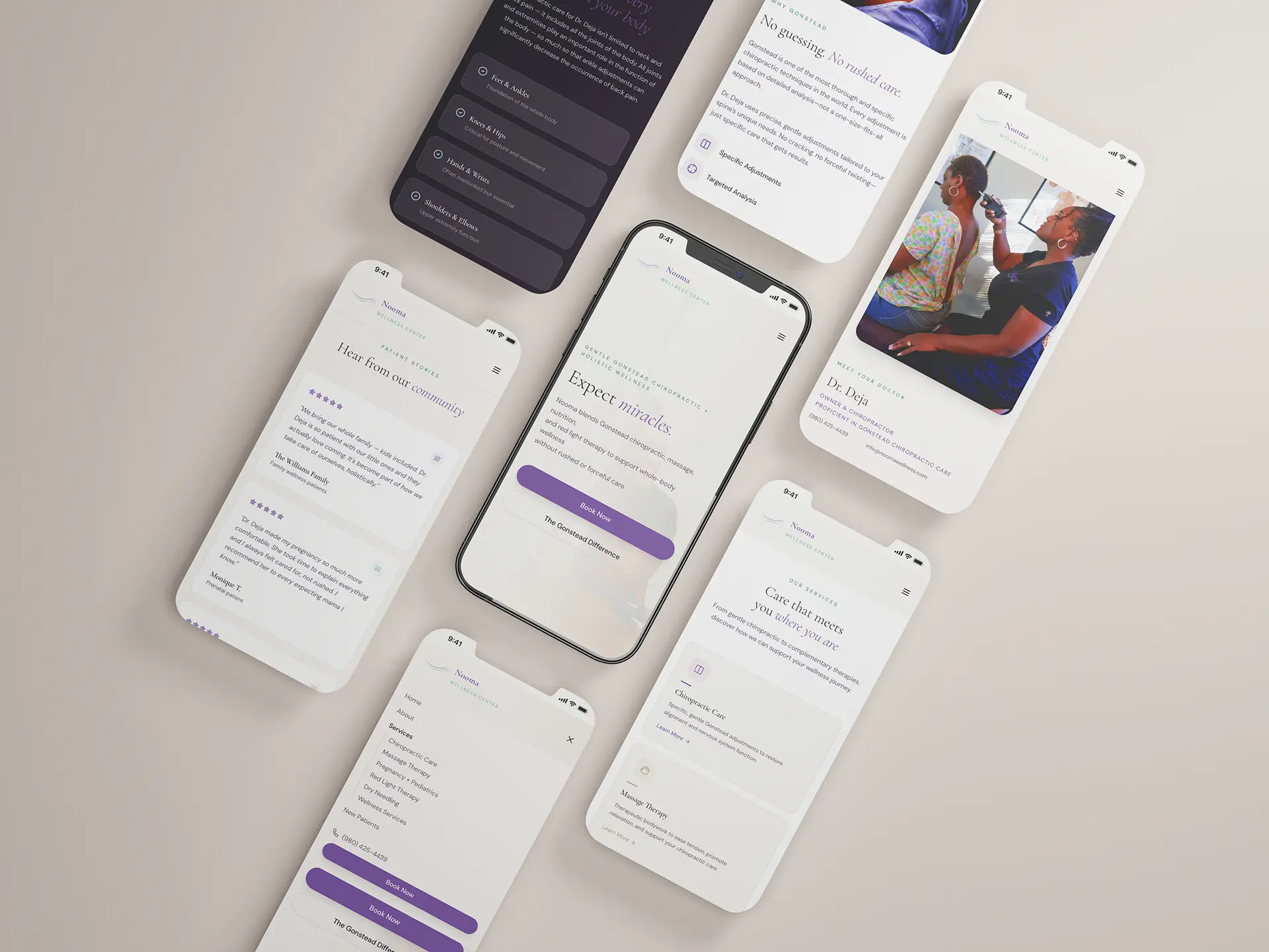
Made for Mobile
Many new patients arrive from search, referrals, or social, often on mobile.
Design With Purpose
I made every choice to help patients understand care and know what to do next.
01
Whole-body first
I led with wellness, not only chiropractic.
02
Gonstead, simplified
I explained the method in clear, approachable language.
03
Clear service paths
I gave every service a clear entry point and next step.
04
Softer visual tone
I softened the palette, opened the spacing, and kept imagery personal.
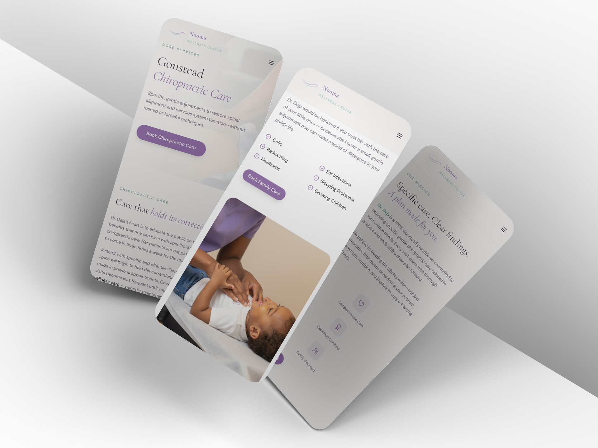
SERVICES, FAMILY CARE & MISSION
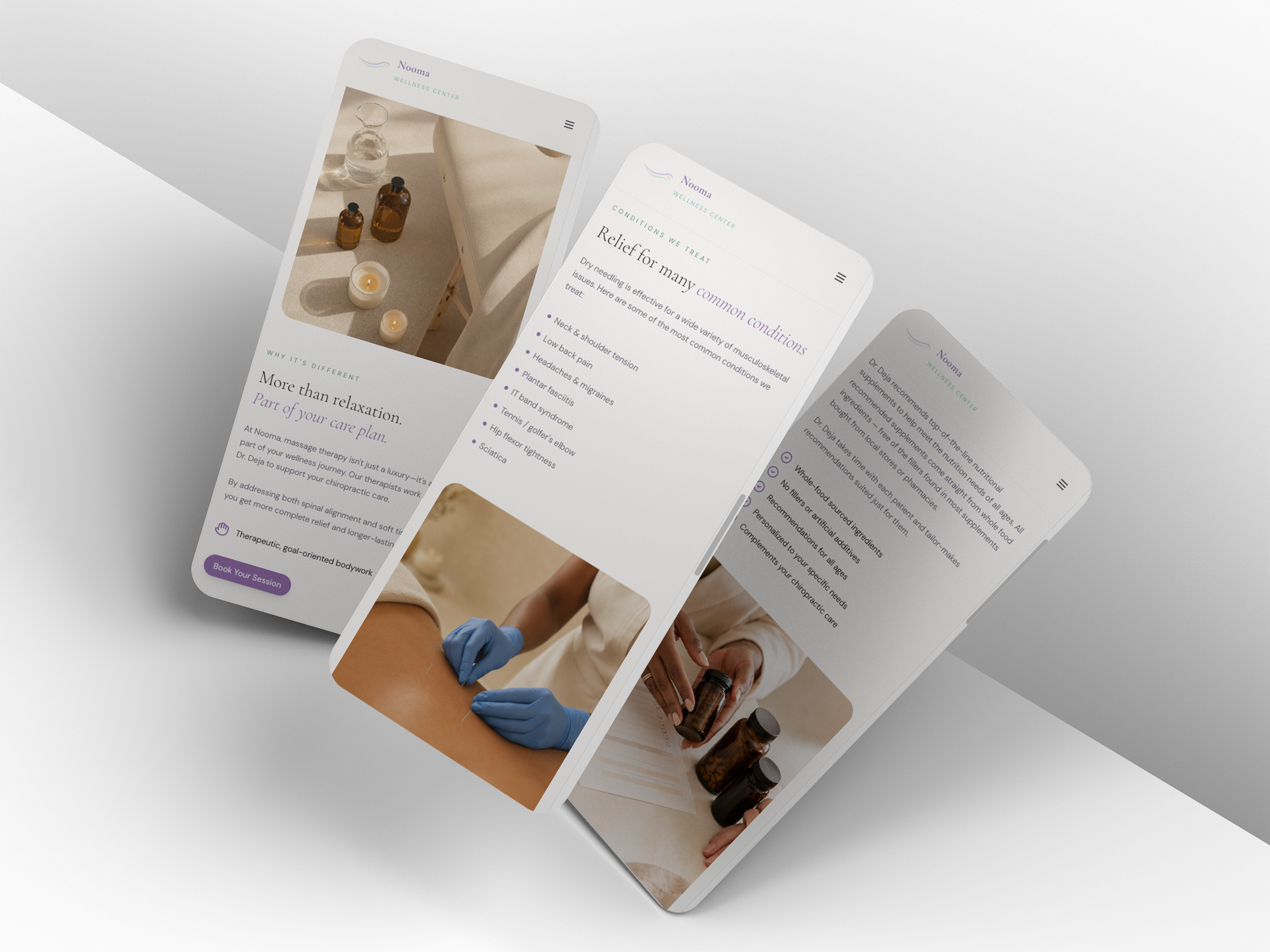
MASSAGE, DRY NEEDLING & SUPPLEMENTS
Now Live
I designed, wrote, and built the new Nooma website from strategy through launch.
2026
Live client website
5
Core services organized around wellness
Desktop + Mobile
Responsive from the start
Live
Strategy, copy, design + build
The final site gives Nooma room to grow without losing the personal care behind the brand.
LIVE CLIENT WEBSITE · NOOMA WELLNESS
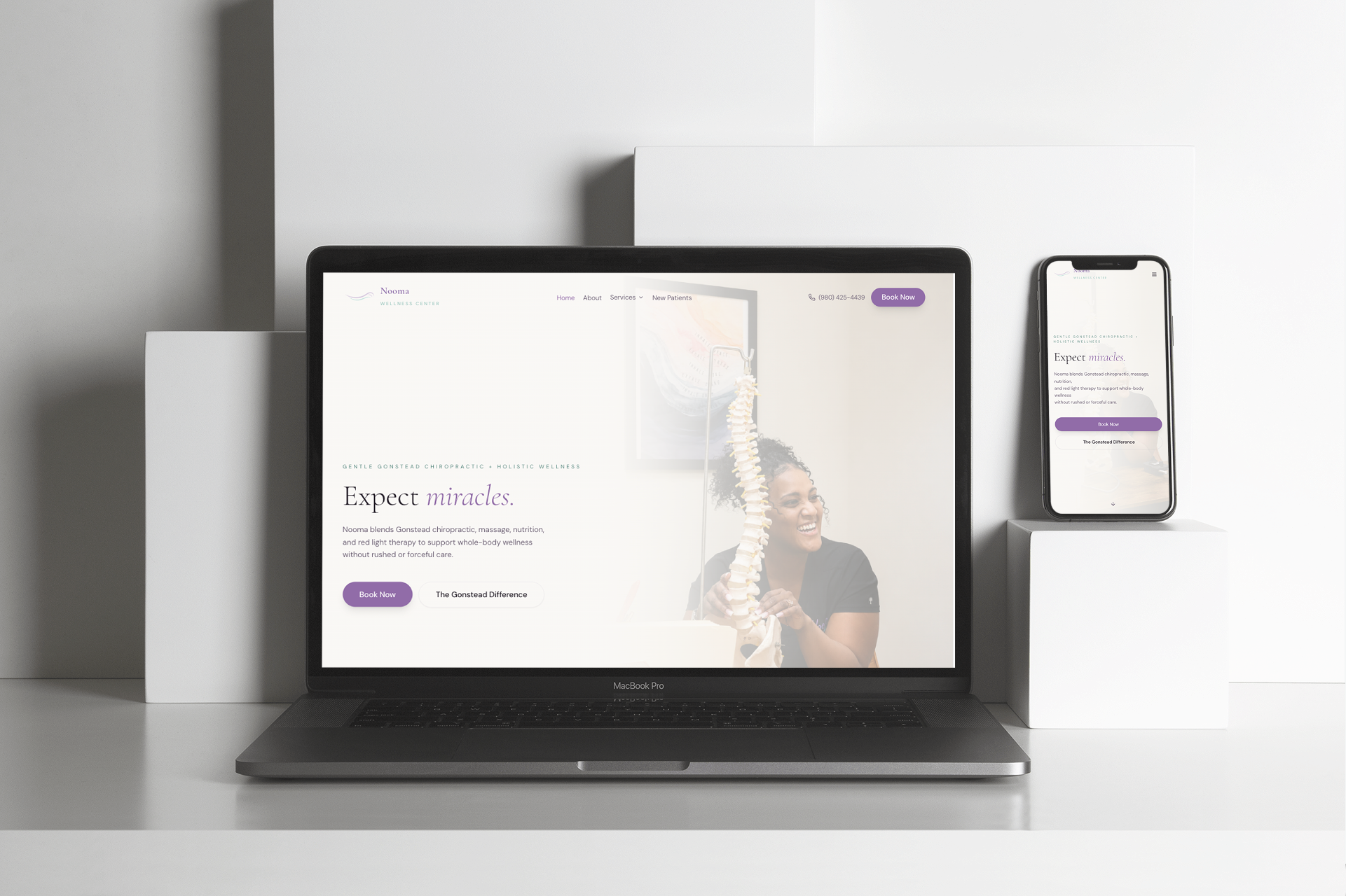
LIVE SITE · NOOMA WELLNESS
What I Learned
01
Positioning matters.
A site can shift perception before a patient ever books.
02
Mobile changes the writing.
Shorter copy and clearer hierarchy make care easier to understand.
03
Trust is visual.
Soft photography, spacing, and tone help wellness feel approachable.
More Projects
View All
editorial. digital. refined.
Strong structure, intuitive flow, and an editorial eye across UX/UI, web, and visual design.
Charlotte, NC · Remote / hybrid-friendly
© 2026 Amy Design Studio